Clear Sky Science · en
Mapping the Landscape of Open Access Dashboards - A Dataset for Research and Infrastructure Development
Why tracking open science matters to everyone
More and more, taxpayers and citizens are asking a simple question: if we pay for research, why can’t we read it? Open Access aims to make scholarly work freely available online, but until now it has been surprisingly hard to see how far we’ve come. This article presents a new, openly available dataset that brings dozens of existing monitoring tools—"dashboards"—together in one place, so policymakers, librarians, and the public can better understand how open our science really is.
Seeing science at a glance
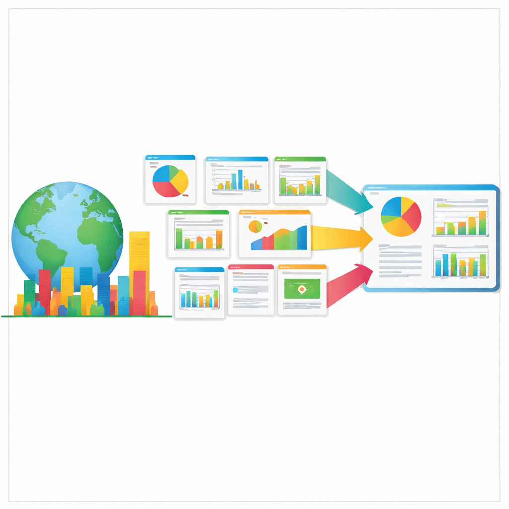
Dashboards are visual tools that turn complex numbers into at-a-glance pictures—an approach that became familiar during the COVID-19 pandemic, when many people checked online maps and curves every day. In the world of research, similar dashboards are now used to show how many articles or datasets are freely accessible, which countries or institutions are leading the way, and how quickly policies are changing practice. Because open access has become a central goal for governments, funders, and universities, these dashboards are increasingly influential in shaping how money is spent and how success is judged.
A scattered landscape of tools
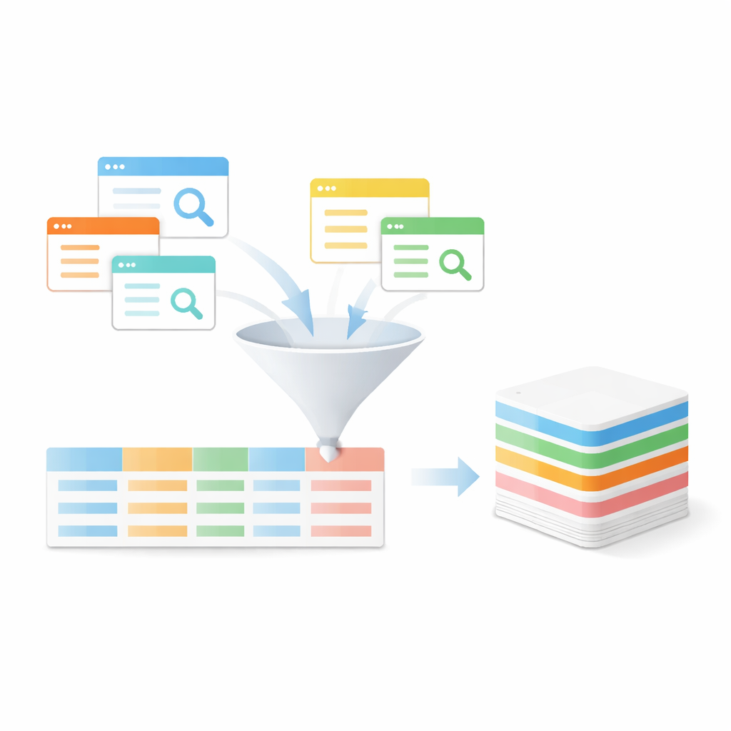
Until now, no one had a clear map of all these dashboards. The authors searched the web systematically in late 2024 and early 2025, combining terms like “open access,” “open science,” and “dashboard” in multiple search engines. They looked for any online tool that reported data on open access to publications or related research outputs, even when this was only one feature among many, as in global university rankings. Whether a dashboard was still actively updated did not matter; if it was accessible and contained relevant open access information, it was considered. This search uncovered 63 distinct dashboards around the world, ranging from international observatories to national barometers and institutional monitors.
Turning scattered dashboards into structured data
Finding the dashboards was only the first step. To make them comparable, the team designed a detailed metadata schema—a kind of standardized catalog record—for each one. The schema captures who runs the dashboard, what geographic area it covers, which types of research outputs it tracks (articles, data, software, or infrastructure), what time period the data span, where the underlying data come from, and how both software and data are licensed. It also notes whether dashboards are part of larger collections, such as the CHORUS or OpenAIRE families, and includes links to documentation or methods pages where readers can learn how the numbers were produced. Each record was initially filled in by one person, checked by another, and then proof‑read by an external reviewer to catch inconsistencies or misunderstandings.
What the new map reveals
The resulting overview shows that most dashboards focus on textual publications, such as journal articles, though many also include research data or software. Thirteen dashboards track research institutions, thirty‑one work at the national level, and eighteen operate internationally. There is a clear concentration in Europe, where all institutional dashboards are based and most national ones reside, with additional examples from the United States, Australia, Japan, and South Korea. The authors stress that this pattern likely reflects language and discoverability biases rather than the true global picture: dashboards that are less visible in web search results or that operate mainly in non‑English languages are easier to miss. The dataset therefore serves as a starting point for more inclusive, multilingual mapping in the future.
Open resources for studying openness
To make their work as reusable as possible, the authors have published both the dashboard collection and the metadata schema openly on Zenodo and on the OA Datenpraxis project website, along with an editable version that allows others to suggest new entries. Because the data are in a simple, machine‑readable format, researchers can perform their own analyses—comparing license choices, charting growth over time, or contrasting national strategies. Librarians and infrastructure planners can use the schema as a template when designing new monitoring tools, helping align local dashboards with international best practices. By inviting community contributions, the project also models the very principles of openness and shared stewardship that open access policies promote.
What this means for readers and policymakers
In plain terms, this work gives the world a well-organized address book of open access dashboards and a common language for describing them. Instead of piecing together scattered websites and unclear indicators, decision‑makers can now rely on a transparent, evolving dataset that shows who is measuring what, where, and how. For citizens, it is a step toward greater accountability: with better tools to track progress, it becomes easier to see whether promises about public access to publicly funded research are really being kept—and where more work is needed.
Citation: Schneider, J., Pampel, H. Mapping the Landscape of Open Access Dashboards - A Dataset for Research and Infrastructure Development. Sci Data 13, 677 (2026). https://doi.org/10.1038/s41597-026-07217-z
Keywords: open access, research dashboards, science policy, open science, research data infrastructure