Clear Sky Science · en
A multi-level visual representation dataset for large-scale non-financial information disclosure
Why the Look of Company Reports Matters
When big companies talk about their environmental or social impact, they no longer publish plain black‑and‑white documents. Their sustainability reports are filled with photos, icons, and bold colors designed to catch the eye and shape our impressions. But until now, there has been no large, objective way to measure how these visual choices are used. This study introduces a new dataset and measurement system that turns the look and feel of thousands of Chinese sustainability reports into hard numbers, helping researchers, regulators, and citizens better understand how companies communicate through design as well as words.
From Piles of Reports to Organized Visual Data
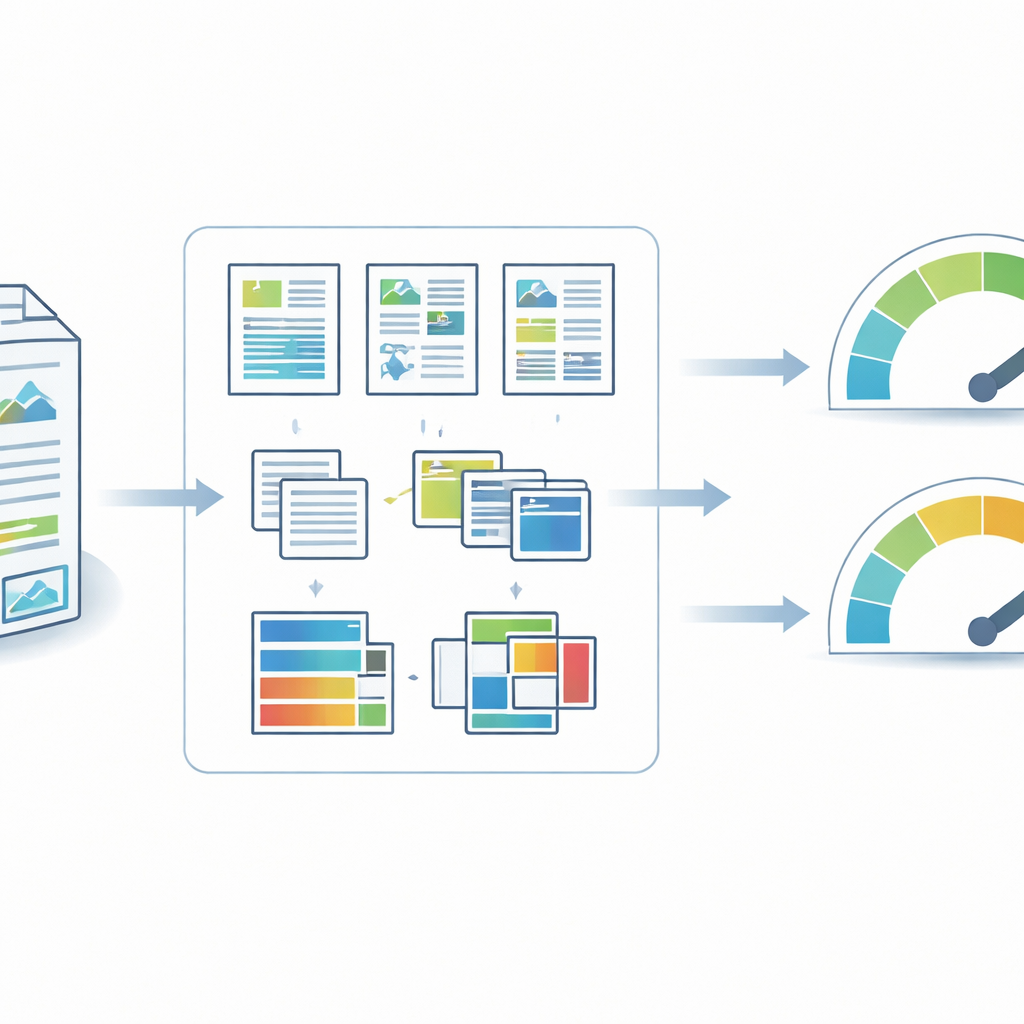
The authors gathered sustainability reports from Chinese companies listed on the Shanghai and Shenzhen stock exchanges, using CNINFO, the country’s official disclosure platform. Covering fiscal years 2006 to 2024, the collection captures how non‑financial reporting in China has grown from a rarity to a common practice, especially after new stock‑exchange rules encouraged firms to report on social and environmental issues. All documents were downloaded in their original PDF format to preserve their visual layout. An automated Python script filtered out corrupt files, extracted basic information such as stock code and year, and organized the reports into a standardized folder system so each file could be uniquely and reliably tracked over time.
Breaking Pages into Text, Pictures, and Color
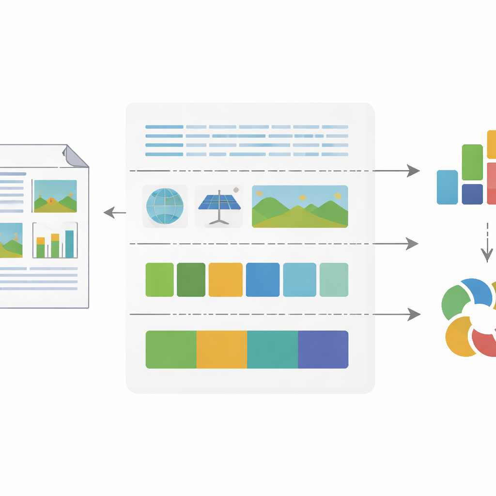
To analyze visuals at scale, the team converted every report page into high‑resolution images and then used modern computer‑vision tools to break these pages into meaningful parts. A layout analysis model identified where text blocks, pictures, tables, headers, and other elements appeared on each page. Text regions were fed into an optical character recognition system that not only read the words but also measured features such as line spacing, font size relative to the page, and how many words appeared in each line and on each page. Image regions were classified as either “abstract” (such as charts or icons) or “realistic” (such as photographs), capturing whether a company leaned more on data‑driven visuals or emotive, photo‑based storytelling. At the same time, a color analysis routine scanned every pixel, sorting it into one of several basic color categories and calculating how much of the page each color occupied.
Turning Visual Style into Numbers
From these building blocks, the researchers defined 18 detailed indicators of how each page and each report uses text, images, and color—ranging from the share of space taken up by pictures, to the balance between warm and cool tones. They then combined these indicators into two key indices. The Information Entropy Index measures visual complexity by looking at how varied the color palette is: pages that use many different colors in similar proportions receive high scores, while simple, nearly monochrome pages score low. The Feature‑Correlation Index captures how visually consistent a report is from page to page by calculating how similar the pages are to each other in this 18‑dimensional feature space. Lower values mean the pages follow a steady visual style; higher values mean the design shifts more dramatically across the document.
Checking That the Numbers Match Human Impressions
Because the value of any index depends on whether it reflects what people actually see, the team carefully validated their measures. They fine‑tuned and tested their computer‑vision models on thousands of manually labeled pages and images, reaching high levels of accuracy in identifying layout elements, reading text, and distinguishing abstract diagrams from realistic photos. To test the new indices themselves, they compared NFIVI scores with ratings from human experts and several AI systems asked to judge how complex and how consistent different reports looked. Strong correlations showed that higher entropy scores really do correspond to busier, more colorful layouts, while lower feature‑correlation scores align with reports that appear visually steady and unified to human eyes.
What This Means for Readers and Watchdogs
In everyday terms, this work creates a kind of “visual fingerprint” for thousands of corporate sustainability reports. It allows researchers to ask, for example, whether firms that are under pressure for poor environmental performance rely more heavily on bright colors and glossy images, or whether more sober designs accompany more trustworthy disclosures. Regulators and watchdog groups could use these tools to spot potentially misleading designs or to monitor how reporting styles change after new rules are introduced. By translating page layouts, picture choices, and color schemes into transparent metrics, the dataset makes it possible to study not just what companies say, but how they choose to show it.
Citation: Li, B., Xia, B., Cheng, Z. et al. A multi-level visual representation dataset for large-scale non-financial information disclosure. Sci Data 13, 500 (2026). https://doi.org/10.1038/s41597-026-06848-6
Keywords: sustainability reporting, visual communication, corporate disclosure, data-driven auditing, environmental social governance