Clear Sky Science · en
High-Resolution dataset on elderly care facility accessibility and inequality in 21 Chinese cities (2020)
Why Access to Elder Care Near Home Matters
As China grows older, where an elderly person lives can strongly shape how easily they find a bed in a care home or community center. This study creates the first detailed, city-by-city map of how close older residents are to formal care facilities in 21 major Chinese cities around the year 2020, and how fairly those services are shared across neighborhoods. The results offer a new, open database that planners, doctors, and researchers can use to spot places where support is plentiful—and where older people may be quietly left behind.
What the Researchers Set Out to Map
The team wanted to answer two simple but pressing questions: How easy is it for older adults in big Chinese cities to reach an elder care facility, and how uneven is that access from one neighborhood to another? Until now, there was no consistent, high-detail dataset that covered many cities at once. Without such data, it is hard for city governments to move from broad promises to targeted improvements—for example, deciding exactly where to build new homes or how new transport lines might help older residents.
How They Measured Getting to Care
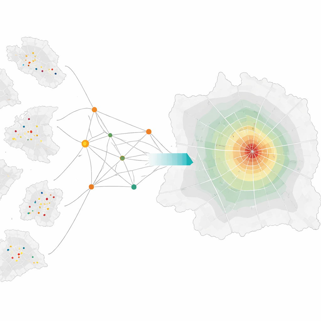
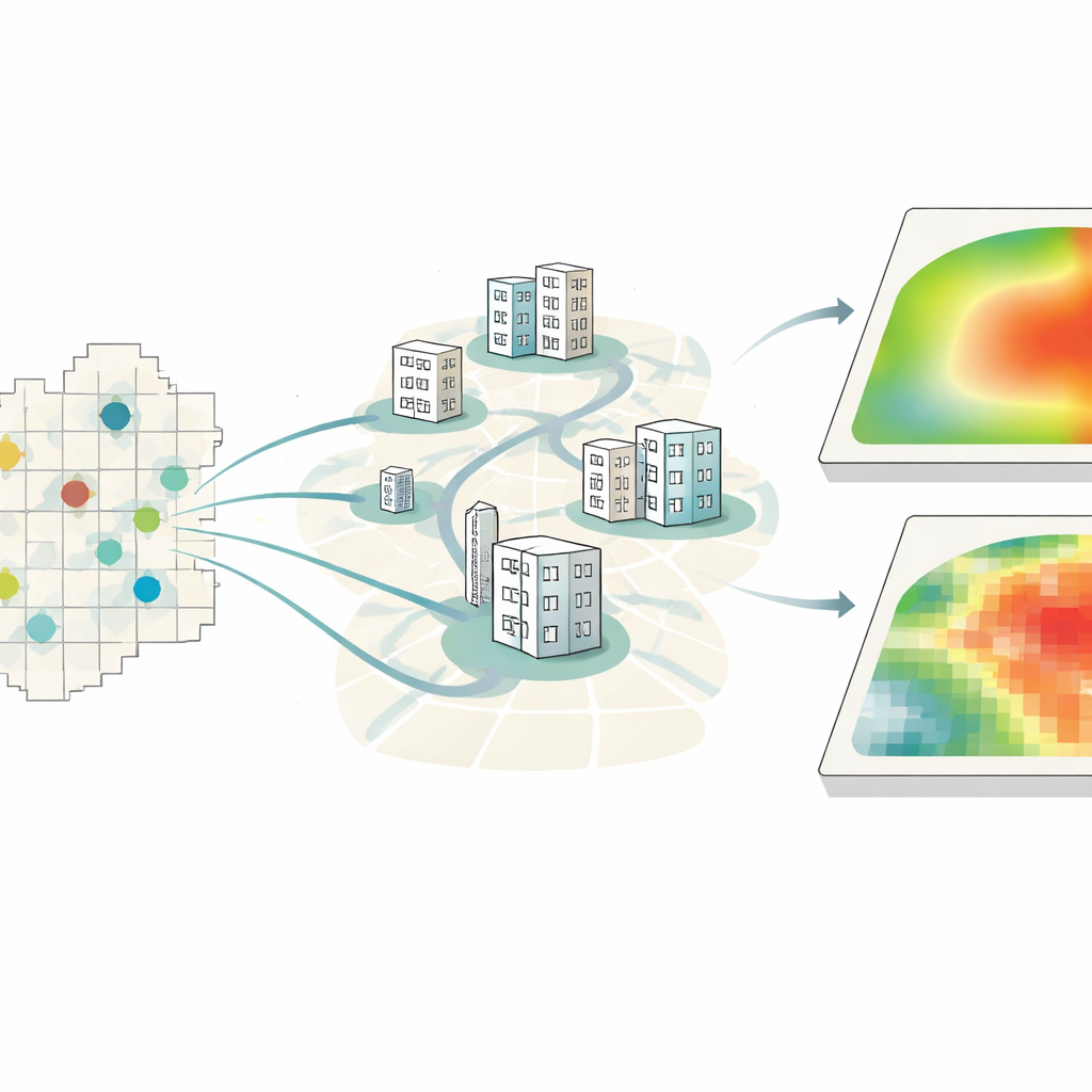
To build this picture, the authors combined several types of open data. They gathered the official locations and bed numbers of all registered elder care facilities in 21 cities, high-resolution population maps showing where older residents live at a 100-meter grid scale, and detailed digital road networks from OpenStreetMap. Using these ingredients, they applied a step-by-step mapping method that estimates, for each tiny grid cell in a city, how many facility beds are realistically reachable along the road network, while gently reducing the weight of facilities that are farther away. Larger facilities were assumed to draw people from wider areas, but the method avoids a sharp cutoff, better matching how people actually consider slightly more distant options.
Turning Access into a Picture of Fairness
Once each grid cell had an accessibility score, the researchers asked a second question: How fairly are these opportunities distributed within each city? To answer this, they used a standard inequality measure that compares how evenly accessibility is spread across space, from perfect equality to extreme imbalance. They summarized these patterns on a coarser one-kilometer grid, creating a companion set of maps that highlight where access is highly unequal. All told, the project produced 42 map layers—one accessibility and one inequality map for each city—plus a table linking these patterns to basic economic indicators.
What the Maps Reveal About City Patterns
Across all 21 cities, a clear theme appears: strong cores and weaker edges. Central urban districts typically enjoy dense, overlapping service areas where many facilities and good road links give older residents multiple options. As one moves toward suburbs and fringe areas, accessibility steadily falls, and the inequality between nearby neighborhoods often grows. In some cities, only a small share of land reaches high accessibility, while vast outer zones remain low. The authors carefully checked their travel-distance calculations by comparing them to popular online map services, finding very close agreement, which supports confidence in the resulting maps.
How This Resource Can Be Used and Its Limits
This dataset is meant as a foundation rather than a final verdict on elder care. Because it uses standard formats, it can be plugged into common mapping and statistical tools to study links between access to care and health outcomes, housing prices, or social disadvantage. Planners can use it to locate "care deserts" and test how new facilities or transport routes might change the picture. At the same time, the authors note important limits: the maps focus on road distance rather than full travel time or public transit; they treat all beds as equal in quality and cost; and they capture a single moment around 2020, not how cities change over time. Even with these caveats, the work marks a major step toward clearer, evidence-based planning for aging societies.
What This Means for Older People in Cities
For a lay reader, the takeaway is straightforward: not all city neighborhoods give older residents the same chance to find nearby, formal care. This study does not prescribe specific policies, but it hands decision-makers a finely detailed map showing where help is close at hand and where it is missing. As China—and many other countries—continue to age, such open, citywide snapshots can guide smarter investments so that growing old does not depend so heavily on one’s postal code.
Citation: Han, X., Wang, Y., Wei, Z. et al. High-Resolution dataset on elderly care facility accessibility and inequality in 21 Chinese cities (2020). Sci Data 13, 606 (2026). https://doi.org/10.1038/s41597-026-07014-8
Keywords: elderly care, urban inequality, China cities, healthcare access, spatial data