Clear Sky Science · en
Heat Stress Metrics for US Census Tracts 1998–2020
Why heat feels worse than the weather report
When a heat wave strikes, the temperature you see on a weather app only tells part of the story. How hot it actually feels—and how dangerous it is for our bodies—also depends on humidity, sunshine, and wind. This study delivers a detailed, nationwide picture of that "felt heat" for every neighborhood-level census tract in the contiguous United States, hour by hour from 1998 to 2020, giving public health researchers a powerful new tool to understand who is most at risk when the country heats up.
From simple temperatures to real-world heat stress
Most past research on heat and health has relied on standard air temperature, the familiar dry reading in weather forecasts. But our bodies react to a more complex mix of conditions. Sticky humidity slows the body’s ability to cool by sweating, bright sun adds extra radiant heat, and even a light breeze can bring relief. To capture this, scientists use specialized measures of heat stress, such as the Heat Index, Wet-Bulb Globe Temperature, and the Universal Thermal Climate Index. Each one blends temperature with other weather ingredients in slightly different ways to track how much strain heat puts on people. Until now, however, such measures have rarely been available at fine detail across both space and time, especially in formats that match the neighborhood boundaries used in health and social data.
Building an hour‑by‑hour heat map of the nation
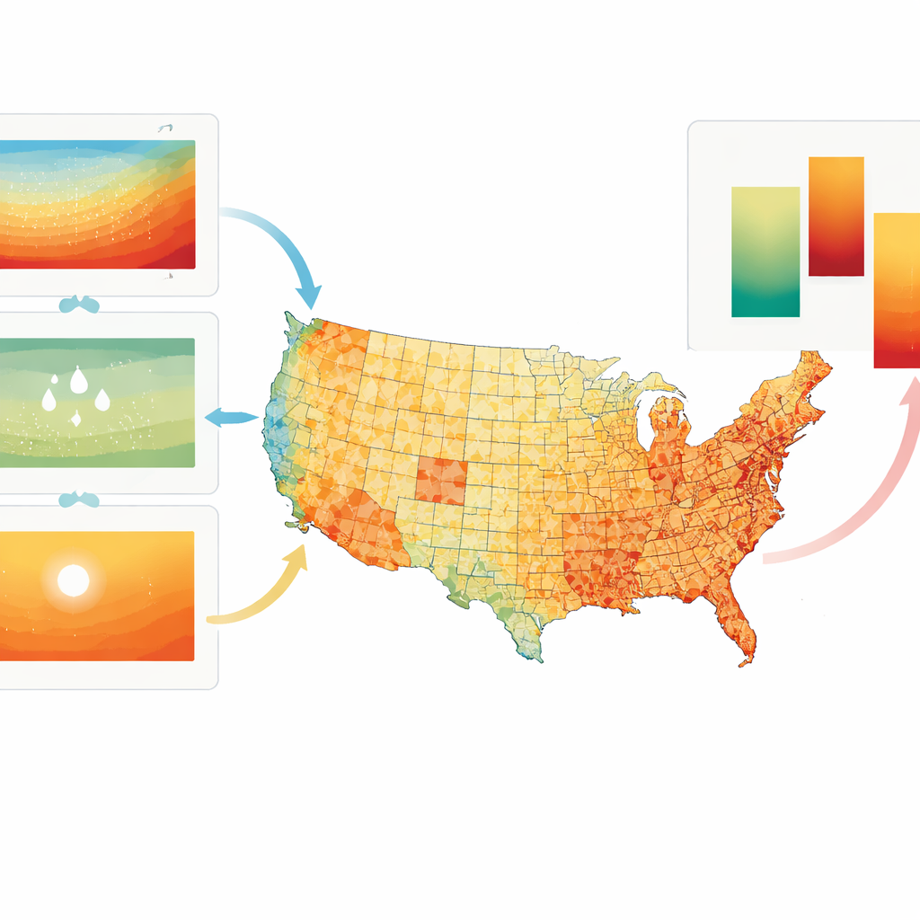
The authors combined three major weather and solar databases to reconstruct how heat changed across the lower 48 states, every hour for more than two decades. One dataset (PRISM) offers detailed daily maps of temperature and moisture at roughly 800‑meter resolution, fine enough to distinguish conditions between nearby neighborhoods. Another (ERA5‑Land) provides hourly weather patterns, such as temperature swings within each day and wind speed, but on a coarser grid. A third source (the National Solar Radiation Database) supplies information on sunlight and radiation. By carefully blending the strengths of these sources—using the daily highs, lows, and moisture from the detailed maps and the hourly rhythm from the broader reanalysis—the team reconstructed realistic hourly temperature and humidity fields on a uniform 800‑meter grid. They then interpolated wind, radiation, and related variables onto that same grid.
Translating weather into human heat strain
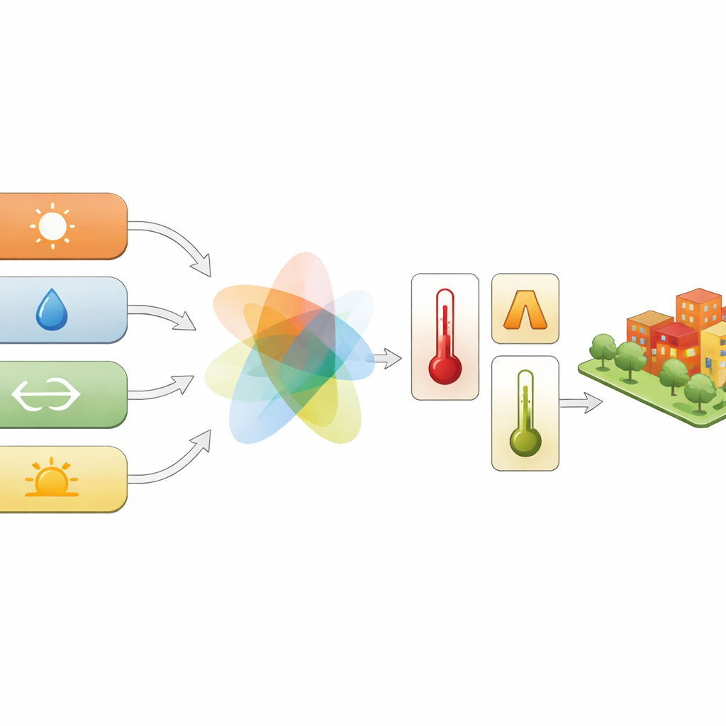
With these hourly weather ingredients in place, the researchers calculated three key heat‑stress metrics at every 800‑meter grid cell. The Heat Index describes how hot it feels by combining temperature and humidity. Wet-Bulb Globe Temperature adds the effects of wind and sunshine, and is widely used to guide outdoor labor and military training. The Universal Thermal Climate Index goes a step further, incorporating a model of how a walking person exchanges heat with the surrounding environment, including radiant heat from the sun and the ground. The team relied on well‑tested physical and statistical models implemented in open‑source Python tools to ensure that the calculations follow accepted scientific practice. They also derived both area‑weighted and population‑weighted values, so that either the land itself or the number of people living in a given place can define the average exposure.
Zooming in to neighborhood‑level exposure
To make the data directly useful for health research, the authors aggregated the 800‑meter grid cells into U.S. census tracts, the small geographic units commonly used to protect individuals’ privacy while tracking neighborhood conditions. For each tract, they computed hourly averages for air temperature, humidity, and the three heat‑stress indices, using both land area and local population as weights. This means researchers can now link an hourly history of heat stress with neighborhood‑level information on income, age, health, housing quality, or access to cooling and green space. The entire dataset, about 515 gigabytes in size, is publicly available in an efficient format that can be processed with modern data tools.
Putting the data to the test
To check accuracy, the team compared their reconstructed fields and heat‑stress indices with measurements from thousands of weather stations and specialized observation networks during the warm months of 2010. Across millions of hourly comparisons, the reconstructed temperatures, humidity measures, and heat‑stress indices stayed within a few degrees of observed values and often matched station data better than the underlying coarser weather reanalysis. While some uncertainty remains—especially where radiation or local terrain effects are complex—the performance is in line with other large‑scale climate datasets and offers sufficient precision for most public health analyses.
What this means for people and policy
In plain terms, this work turns scattered weather and radiation records into a high‑resolution, human‑focused map of dangerous heat across American neighborhoods, hour by hour over more than twenty years. By aligning these data with census tracts and providing both area‑ and population‑weighted views, the dataset makes it possible to ask detailed questions about who is exposed to extreme heat, when, and where. City planners, health departments, and researchers can now examine how heat risk overlaps with factors like poverty, age, or housing, helping to guide cooling centers, tree‑planting, building upgrades, and other climate‑ready interventions to the communities that need them most.
Citation: Rahai, R., Kong, Q., Dogan, T. et al. Heat Stress Metrics for US Census Tracts 1998–2020. Sci Data 13, 515 (2026). https://doi.org/10.1038/s41597-026-06909-w
Keywords: extreme heat, heat stress indices, census tract data, public health, climate exposure