Clear Sky Science · en
gTREND-Nitrogen - Long-term nitrogen mass balance data for the contiguous United States (1930-2017)
Why Too Much Fertilizer Matters to Everyday Life
From tap water safety to the health of favorite fishing spots and coastal beaches, the way we use nitrogen on farms and in cities quietly shapes daily life across the United States. This paper introduces a powerful new map-based dataset, called gTREND‑Nitrogen, that tracks where nitrogen is added to and removed from the landscape across the lower 48 states, year by year, from 1930 to 2017. By revealing how nitrogen builds up or is used in specific places, at a fine 250‑meter grid scale, the work offers a new lens for understanding polluted wells, algal blooms, and why cleanup efforts can be slow to show results.
How Nitrogen Moves Through Our Lands and Waters
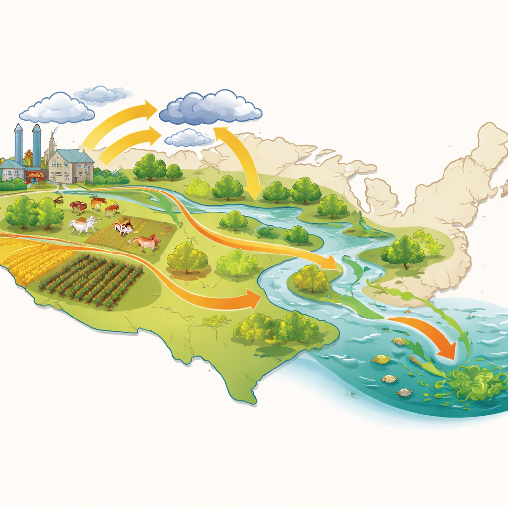
Nitrogen is a basic ingredient for plant growth, but in excess it becomes a pollutant. Over the past century, population growth, more intensive farming, changing diets, and biofuel production have all increased the flow of reactive nitrogen through the environment. Fertilizer, livestock manure, nitrogen‑fixing crops such as soybeans and alfalfa, fallout from the air, and human waste all add nitrogen to the land. Crops and pasture grasses take some of it back up, but much of the rest seeps into groundwater or runs off into streams, rivers, lakes, and coastal waters. There it can fuel algal blooms, create low‑oxygen “dead zones,” threaten drinking water, and release powerful greenhouse gases.
The Need for a Sharper Picture
Policymakers have tried for decades to curb nutrient pollution, yet improvements in water quality have often been frustratingly slow. One reason is “legacy” nitrogen: decades of past inputs stored in soils and groundwater that continue to leak out long after surface applications are reduced. To manage this legacy and design fair, effective policies, scientists need long records that show not just how much nitrogen enters and leaves a region, but where on the landscape it does so. Previous U.S. datasets either covered only parts of the nitrogen budget, worked at coarse county scales, or focused on short time spans, limiting their usefulness for small watersheds, rural communities, or local planning.
Building a Detailed Map of Nitrogen Use
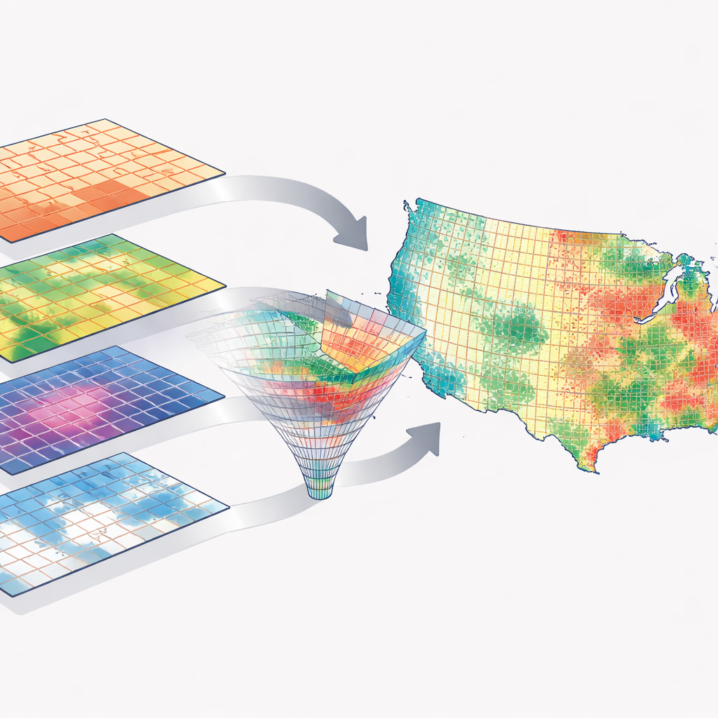
The authors tackle this gap by starting from an updated county‑level nitrogen budget called TREND‑Nitrogen v3 and then “downscaling” it onto a fine grid. For every year from 1930 to 2017, they assemble county data on fertilizer use, manure from different livestock types, nitrogen‑fixing crops, crop harvest, pasture use, atmospheric deposition, and human population. They then combine these records with high‑resolution land‑use maps and population grids to estimate, for each 250‑meter cell, how much nitrogen is added (from fertilizer, manure, deposition, fixation, and human waste) and how much is removed by crops and grazing animals. The result is a gridded nitrogen “surplus” map that highlights where inputs exceed plant uptake and are most likely to leak into water or the air.
Checking Reliability and Comparing with Other Studies
To ensure the new grid‑based estimates are trustworthy, the team re‑aggregates them back up to counties and compares them to the original TREND‑Nitrogen values. The match is extremely close for all components of the nitrogen budget, showing that the downscaling conserves mass and mainly redistributes nitrogen within counties according to land use and population patterns. The authors also compare their numbers with several established national datasets for fertilizer use, manure production, and nitrogen falling from the atmosphere. Despite differences in methods and resolution, the new dataset lines up very well overall, while also incorporating more up‑to‑date information on livestock and more realistic year‑to‑year changes in nitrogen deposition from the air.
Why Finer Resolution Changes the Story
One of the most practical tests in the study asks how much it matters to use county‑level averages versus the new 250‑meter grid when assessing nitrogen conditions in real watersheds. For more than 1,000 U.S. river basins, especially smaller ones, the authors show that relying on county‑level data alone can either overestimate or underestimate nitrogen surpluses by a wide margin. Because land use within a county can be a patchwork of cropland, pasture, forest, and development, smaller basins often do not “look like” the county as a whole. The gridded dataset captures this fine‑scale mosaic, making estimates for small and medium‑sized watersheds—where communities often manage drinking water and local ecosystems—far more accurate.
What This Means for Water, Climate, and Policy
In simple terms, this work delivers a long, detailed history of how and where nitrogen has accumulated across the contiguous United States. By showing which places have persistent surpluses and how those patterns have shifted over nearly nine decades, gTREND‑Nitrogen can help researchers trace the roots of today’s water quality problems, design better models, and identify realistic timelines for recovery. For decision‑makers, the dataset offers a transparent, publicly available tool to target interventions, track progress, and discuss trade‑offs with farmers, towns, and other stakeholders. While it does not by itself solve the political and social challenges of nitrogen management, it provides a much clearer map of the problem—an essential step toward cleaner water, healthier ecosystems, and more sustainable food production.
Citation: Chang, S.Y., Byrnes, D.K., Basu, N.B. et al. gTREND-Nitrogen - Long-term nitrogen mass balance data for the contiguous United States (1930-2017). Sci Data 13, 562 (2026). https://doi.org/10.1038/s41597-026-06576-x
Keywords: nitrogen pollution, water quality, fertilizer use, watershed modeling, environmental datasets