Clear Sky Science · en
How common depictions of wealth distributions can bias people to underestimate inequality
Why the Way We Picture Wealth Matters
Debates about the gap between rich and poor often hinge on a simple question: just how unequal is our society? This paper shows that the answer people see depends heavily on how the numbers are shown to them. Common charts, tables, and headlines about wealth can quietly make inequality look milder than it really is, which in turn can dampen support for policies that would narrow the gap.
Hidden Traps in Everyday Inequality Stories
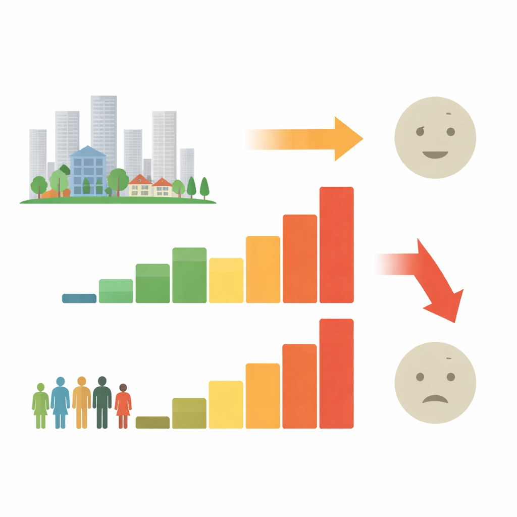
The authors begin by looking at nearly 3,000 newspaper articles from major U.S. outlets that mentioned economic inequality. They find three striking patterns. Most stories focus on very unequal group sizes, such as the richest 1% versus the rest. Most also use “total wealth held” by each group rather than what an average person in that group owns. And almost all rely on words or tables instead of visual graphs. On the surface these seem like harmless choices, but together they tend to soften how unequal the distribution appears to a casual reader.
How Grouping People Changes the Picture
Across several experiments with U.S. adults, the authors show that people are surprisingly insensitive to how many people fall in each group when judging fairness. They pay attention to the wealth of the groups that are named, but not enough to the fact that some groups might be tiny slices of the population. This leads to what the authors call “partition dependence”: simply carving the same society into different groupings changes how fair it seems. When the top portion of the population is split into more, smaller slices, people become more tolerant of inequality, even though the underlying reality has not changed at all.
Forgetting the Middle of the Pack
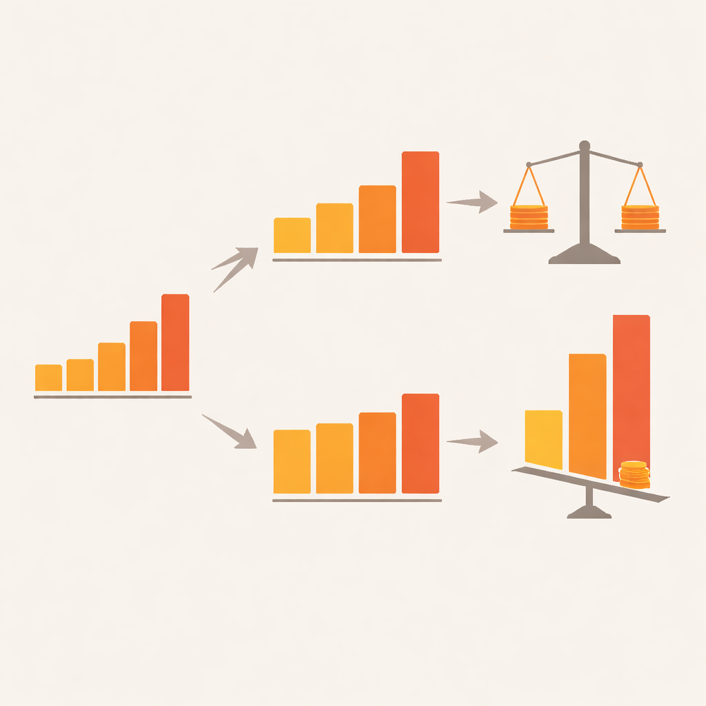
The studies also reveal a second pattern the authors term “middle neglect.” When participants rated how fair different income patterns were, doubling the income of the poorest group made distributions look much fairer, and doubling the income of the richest group made them look less fair. But doubling the income of the middle group barely moved people’s judgments, despite making the distribution objectively more equal. Follow-up work suggests this is not because people do not care about the middle class—they say they do—but because their attention naturally gravitates to the most and least well-off, leaving the middle as a kind of cognitive blind spot.
Using Better Pictures to Reduce Bias
The authors then test ways to counter these biases. One approach is to use “partition-invariant” metrics, such as the average wealth per person in each group rather than total wealth per group. When information is presented this way, the impact of arbitrary group sizes shrinks. Another is to rely more on clear visual displays instead of dense tables. Graphs that show both the size of each group and its typical wealth help viewers weigh all parts of the distribution more evenly, making them more sensitive to changes in the middle as well as at the extremes.
What This Means for Public Debates
In everyday politics and media, choices about how to display inequality can shape how serious the problem seems and how strongly people support change. This research shows that many common formats unintentionally nudge audiences toward underestimating how skewed wealth really is. By switching to visuals that adjust for group size and highlight the full range of the population, communicators can offer a truer picture of inequality and support more informed public discussion.
Citation: Bogard, J.E., West, C. & Fox, C.R. How common depictions of wealth distributions can bias people to underestimate inequality. Nat Commun 17, 3897 (2026). https://doi.org/10.1038/s41467-025-62422-5
Keywords: economic inequality, wealth distribution, data visualization, cognitive bias, public opinion