Clear Sky Science · en
A personalized tutorial to improve understanding of individual chemical results and opportunities for reducing exposure
Why this matters to your everyday life
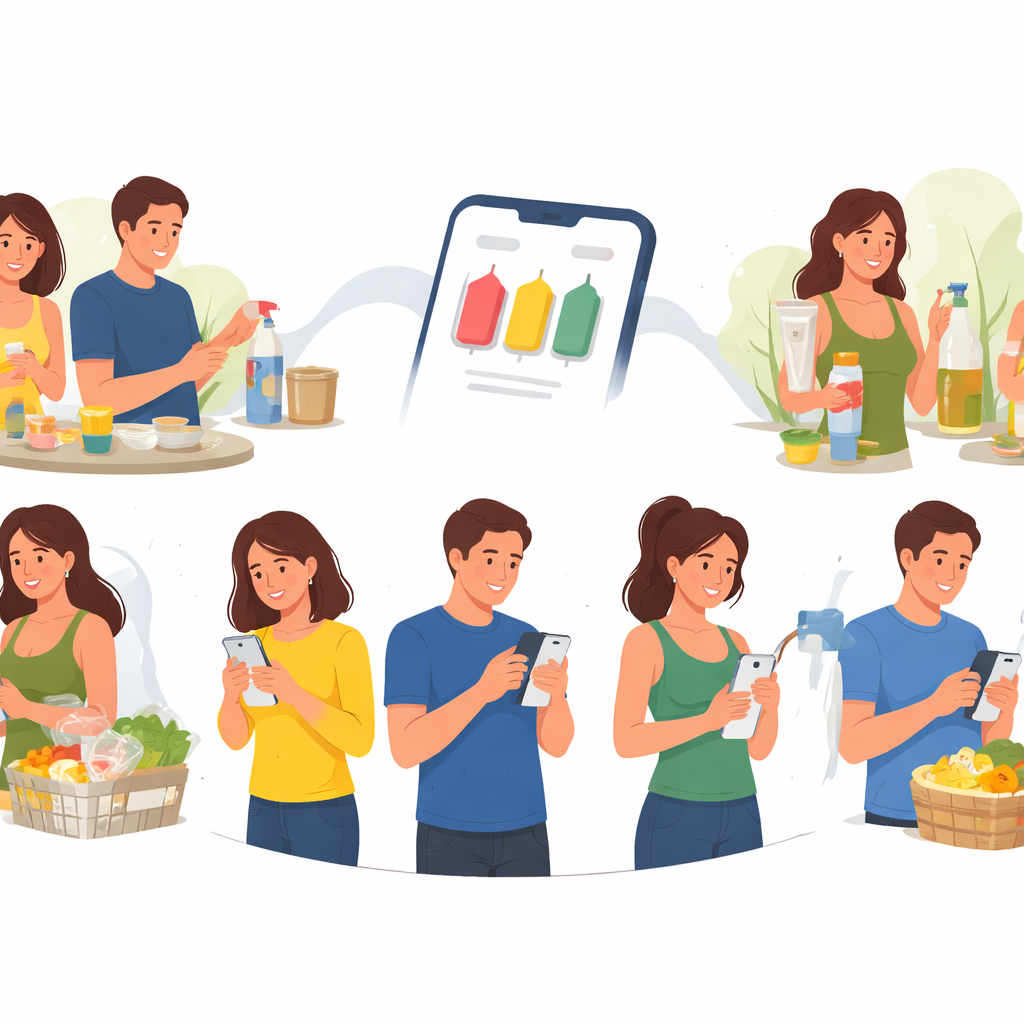
Most of us carry traces of industrial chemicals in our bodies, from plastics and flame retardants to ingredients in soaps and cosmetics. When scientists measure these chemicals in volunteers, they face an important question: how do you clearly explain personal results so that people understand what their numbers mean and what they can do to lower exposures? This study tested a short, smartphone-based tutorial that helps people read their own chemical results and choose practical steps to reduce everyday contact with these substances.
A simple lesson on a small screen
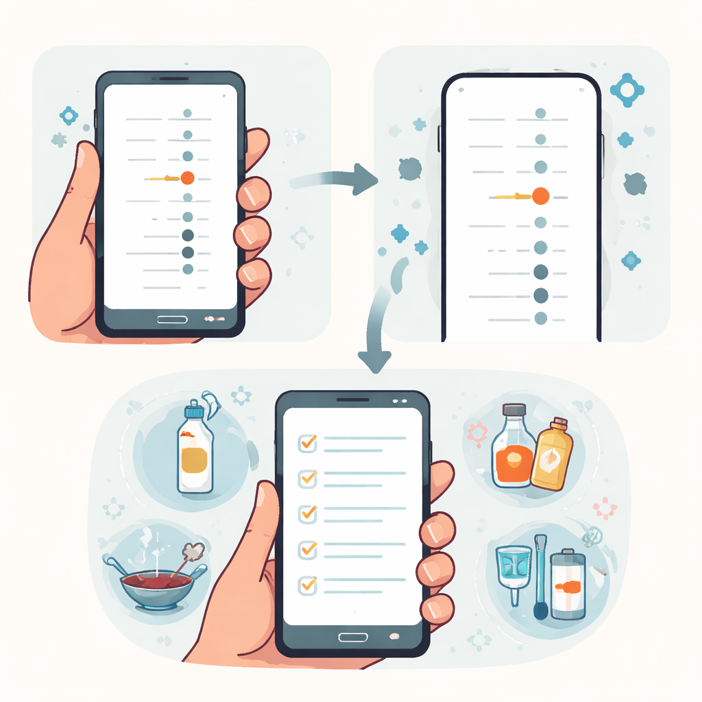
The research team worked with two pregnancy studies in Illinois and California that track how environmental exposures may affect child development. Nearly 300 participants who had given blood or urine samples were invited to view their personal results through an online report designed for phones. Inside that report, some participants saw an interactive tutorial built around a teaching approach called Predict Observe Explain. The tutorial used each person’s real lab data and a simple dot-style graph that showed where their level fell compared with everyone else in the study and with a typical value for women of similar age in the United States.
From guessing to understanding
The tutorial unfolded in three stages. First, in the Predict stage, participants read a short description of how one selected chemical commonly enters daily life, then guessed whether their level would be lower, similar, or higher than others in the study. Most people expected to be about average, but many actually had higher levels, especially because the tutorial usually picked a chemical where their result stood out. Next came the Observe stage, where people answered four quick questions about the graph, such as which point showed the highest level or how their own result compared to others. If a person chose a wrong answer, the program offered a hint and a second chance before giving a clear explanation.
Bridging education gaps
The results showed that the graphs were already fairly intuitive: even without help, 7 in 10 participants answered all four questions correctly on their first try, and another fifth missed only one. Still, people with less formal education or lower income tended to struggle more at first. After going through the brief tutorial, however, understanding improved sharply. Ninety nine percent of users got at least three answers right once hints were included, and the gap between those with and without a college degree narrowed considerably. In other words, the step by step feedback helped level the playing field so that participants with different educational backgrounds could read their graphs with similar success.
Turning information into action
The final Explain stage of the tutorial focused on what to do next. Participants checked off which everyday sources of the featured chemical applied to them, such as certain personal care products, nonstick cookware, or dust at home. The system then returned a tailored list of actions, like choosing stainless steel water bottles, skipping “antibacterial” soaps, or vacuuming with a filter that captures fine dust. For each suggestion, people indicated whether they already did it, wanted to try it, or preferred not to. Among those who did not already follow a given tip, at least three quarters said they wanted to try most of the recommended changes, suggesting that personalized advice based on one’s own data can spark strong intentions to act.
What the study found and why it helps
Overall, participants spent only a few minutes in the tutorial, yet most said it helped them understand their results. The study concludes that a short, well designed digital lesson can both improve how people read their own chemical measurements and reduce differences in understanding tied to education or income. By linking personal numbers to realistic behavior changes, the approach also encourages people to consider steps that may lower future exposures. As more environmental health studies share individual findings with volunteers, tools like this smartphone tutorial offer a practical way to make complex data clearer, fairer, and more useful for everyone.
Citation: Boronow, K.E., Maruzzo, A., Morello-Frosch, R.A. et al. A personalized tutorial to improve understanding of individual chemical results and opportunities for reducing exposure. J Expo Sci Environ Epidemiol 36, 511–520 (2026). https://doi.org/10.1038/s41370-026-00840-3
Keywords: chemical exposure, environmental health literacy, smartphone tutorial, graph understanding, personal results