Clear Sky Science · en
Accessibility features in executive function apps and user performance post-stroke
Why screen design matters after a stroke
After a stroke, many people struggle with everyday thinking skills like planning a shopping trip, sorting medicines, or following directions on a form. Increasingly, these abilities are tested with tablet or computer apps. But what if the way the screen is designed – the layout, the contrast, or whether the text is read aloud – actually changes how well a person appears to think? This study asked whether so‑called accessibility features in test apps truly help stroke survivors, or sometimes make things harder.
Everyday tasks, tested on a tablet
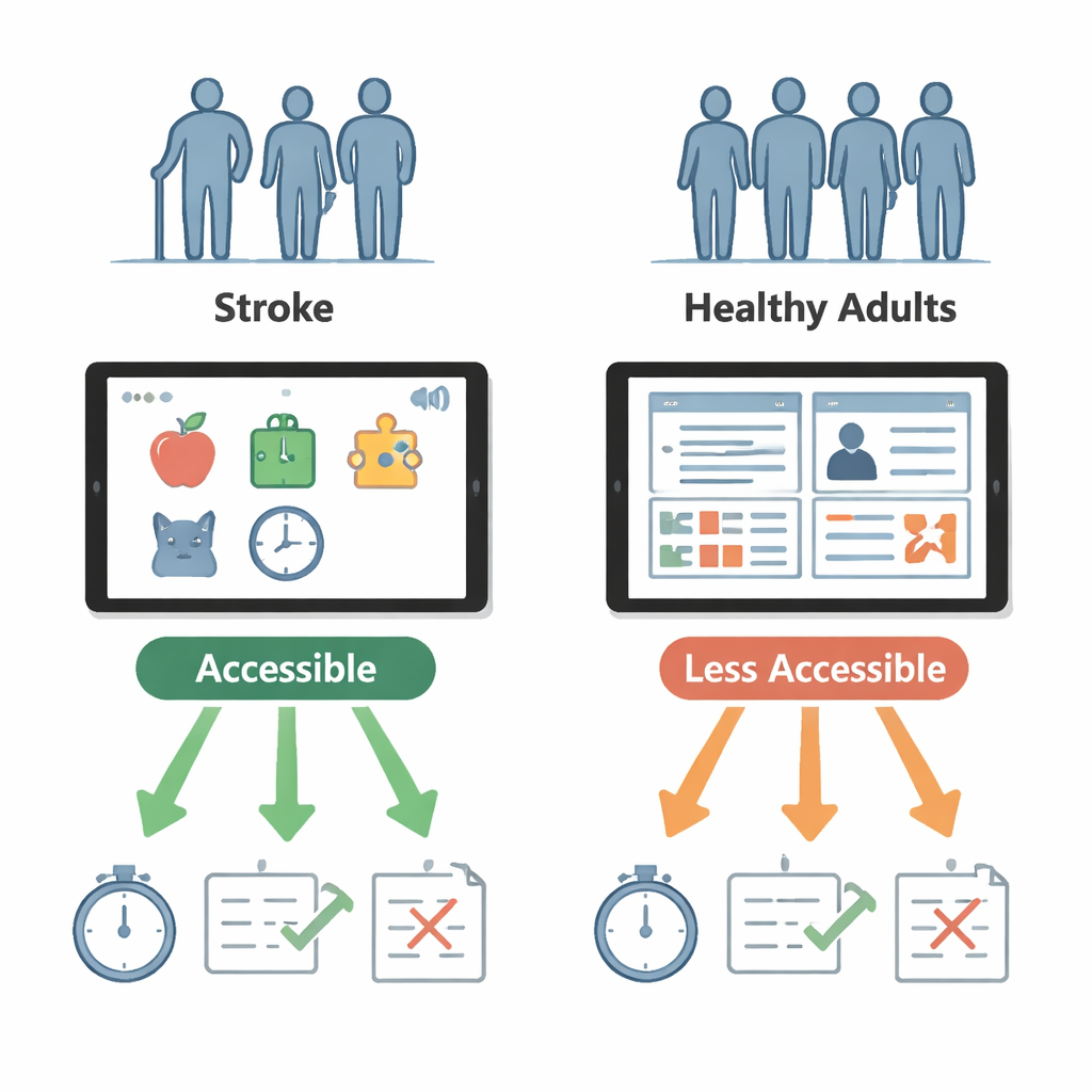
The researchers worked with 32 people in rehabilitation after a stroke and 32 healthy adults of similar age. Everyone tried three tablet-based tests that mimic real-life activities. In a virtual supermarket, called the Four-Item Tablet Test, they had to buy four specific items while staying within a budget. In a medicine-sorting task, they dragged colorful pills into a weekly schedule and ignored “distractor” pills, a stand-in for organizing a complex prescription. Finally, in a digital version of the well-known Trail Making Test, they drew lines connecting numbers and letters in order, a classic way to measure attention and mental flexibility.
Changing what makes an app “accessible”
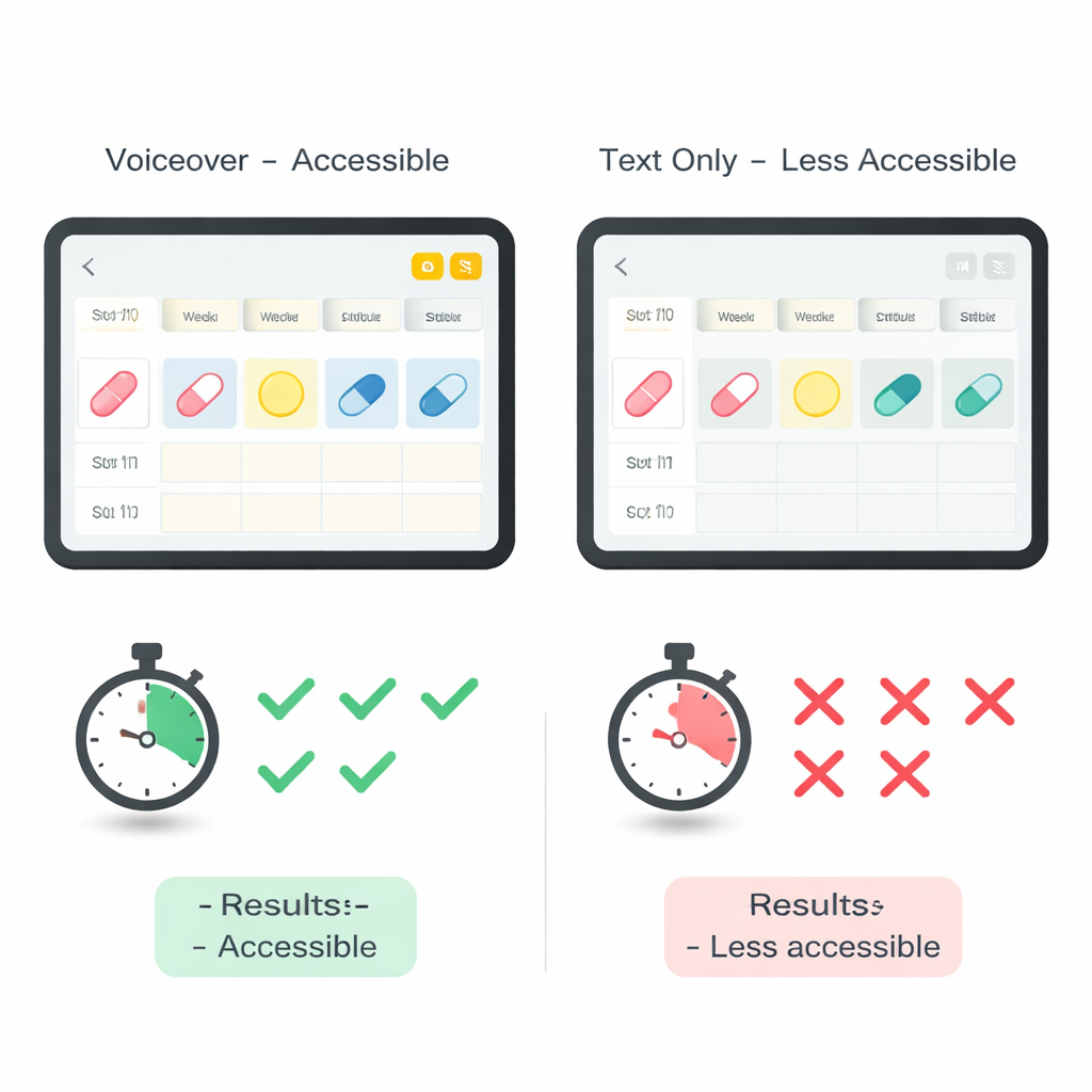
Each of these tests came in two versions. One was designed to be more accessible, based on common guidelines for older or disabled users; the other deliberately left out one key feature. For the shopping task, the accessible version spread information across several pages with larger pictures, while the less-accessible version showed everything on a single busy screen. For the medicine task, the accessible version read text aloud whenever a participant tapped an item, while the less-accessible version relied on reading alone. In the Trail Making Test, the accessible version used stark black-on-white symbols, while the other used lower contrast that was still technically acceptable under web standards. The team checked not only how fast and how accurately people performed, but also how difficult they said each version felt and how easy the app was to use.
When “helpful” design backfires
The results were striking among stroke survivors. In the shopping test, they actually did better on the single-page, supposedly less-accessible layout: they finished more quickly, made fewer mistakes, and worked more efficiently. The multi-page design, meant to reduce clutter, forced them to remember what was on other screens and to constantly switch attention – demands that are especially hard when working memory and visual scanning are impaired after stroke. In contrast, for the medicine task the added voiceover clearly helped: stroke participants started sorting more quickly and placed more pills correctly when spoken guidance was available. For the Trail Making Test, changing contrast within the acceptable range did not meaningfully alter stroke survivors’ performance, even though healthy adults said the low-contrast version felt harder.
Different brains, different needs
Healthy adults performed similarly on both versions of each test, suggesting that these design tweaks matter far more for people whose thinking skills have been weakened by stroke. More detailed analyses showed hints that the damaged side of the brain changes which features help most. People with left-brain strokes, who often have language difficulties, were especially sensitive to how information was laid out in the shopping app. Those with right-brain strokes, who more often have problems with attention and visual exploration, seemed to benefit strongly from voiceover in the medicine task. Yet across all apps, stroke survivors consistently rated both versions as about equally difficult and usable, even when their objective performance clearly differed – a reminder that self-reports alone can miss hidden barriers in digital tools.
Designing fair tests for real people
For a layperson, the key message is that the way a test app looks and sounds can change how “smart” someone appears after a stroke, without their brain changing at all. Features that seem obviously helpful, like breaking a screen into several pages, may overload memory and attention in practice, while simple additions like having the device read the instructions aloud can meaningfully boost performance. Because healthy adults were largely unaffected by these changes, the study suggests that stroke-related thinking and vision problems – not just normal aging – make people vulnerable to poor design. To judge a person’s true abilities, digital assessments must be built and tested with stroke survivors in mind, using layouts and supports that match their specific challenges rather than relying on one-size-fits-all accessibility checklists.
Citation: Latar, S.K., Portnoy, S., Kremer, A. et al. Accessibility features in executive function apps and user performance post-stroke. Sci Rep 16, 6897 (2026). https://doi.org/10.1038/s41598-026-38055-z
Keywords: stroke rehabilitation, cognitive testing, app accessibility, executive function, tablet assessments