Clear Sky Science · en
Data-driven quantification and visualization of resilience metrics of power distribution systems
Why keeping the lights on is getting harder
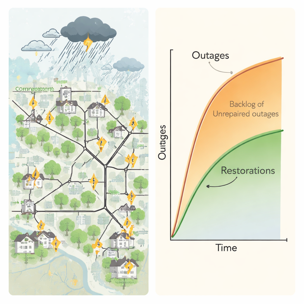
When powerful storms roll through a region, we mostly notice power outages as an inconvenience. But for utilities, each storm is a stress test of the grid’s ability to withstand damage and bounce back. This paper shows how real outage and weather records can be turned into simple, visual measures of how resilient a local power network really is, and which neighborhoods are likely to wait longest for the lights to come back on.
From scattered records to a clear picture
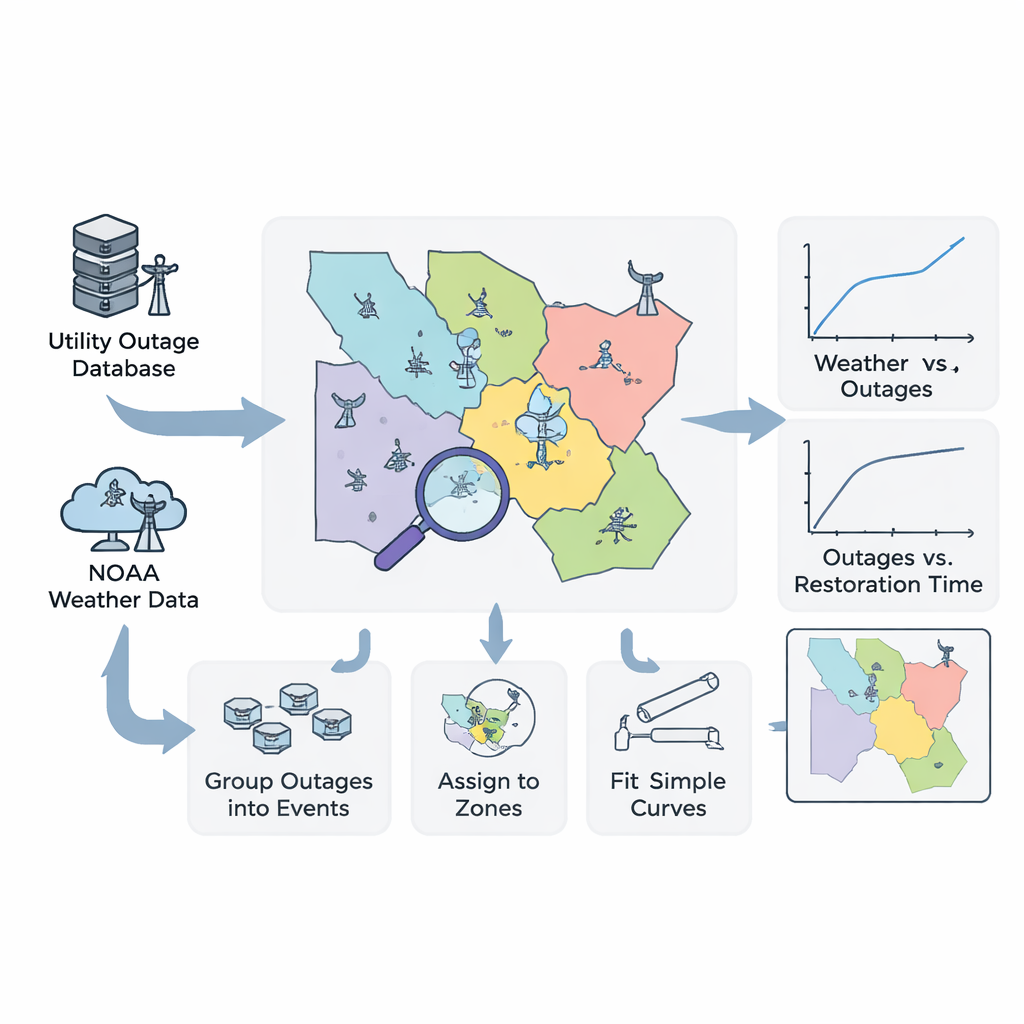
Electric power distribution systems are the last stage of the grid, carrying electricity from high‑voltage lines into towns, streets, and homes. Over years, utilities collect detailed logs every time a component fails and is repaired, along with how many customers were affected. At the same time, federal agencies such as NOAA track wind, rain, snow, and other severe weather. The authors combine two decades of these records from a Midwestern U.S. utility with NOAA weather data to ask a basic question: when storms hit, how many things break, and how long does it take to fix them?
Grouping outages the way storms cause them
Instead of treating every broken line or blown fuse as an isolated incident, the study groups many nearby outages into what it calls an outage‑restoration event. An event starts when the first storm‑driven failure appears and ends only when all damaged components in that episode are repaired. This captures what actually matters to crews and customers: the total pile‑up of repairs during a storm. For each event, the researchers track two easy‑to‑understand numbers: how many outages occurred in total and how long it took, from first failure to last repair, to get everything back to normal.
Turning the map into weather‑based zones
Weather is rarely uniform across a utility’s territory. To respect that, the team divides the service area into zones based on the locations of NOAA weather stations, using a geometric method called Voronoi polygons. Every point on the map is assigned to its nearest station, creating separate wind zones and precipitation zones. Within each zone, the authors match storm logs (for tornadoes, high winds, snow, flooding, and so on) to the outages that happened at the same time and in the same place. This lets them say, for example, “a 35‑meter‑per‑second wind in Zone 0 typically produces about this many outages.”
Simple curves that capture complex behavior
With events and zones in hand, the authors build two kinds of data‑driven curves. Fragility curves relate storm intensity to the number of outages in a zone: as wind speed or rainfall increases, the number of failures rises sharply, often in an exponential way. Restoration curves then relate the number of outages in an event to how long full repair takes. These show that when only a few components fail, repairs are quick, but once outages pass a certain level, restoration time grows rapidly as crews and equipment become saturated. Because the models are based on simple mathematical functions, utilities can easily understand and update them as new data arrives.
Seeing resilience on the map
By feeding a hypothetical storm into these two curves—first estimating how many outages it would cause, then how long repairs would take—the framework produces a predicted restoration time for each weather zone. Plotting those predictions on a map reveals which parts of the territory are more or less resilient to wind or heavy precipitation. Some zones show relatively few outages and faster recovery; others face more damage and longer waits for service. These zone‑by‑zone maps turn raw historical data into practical guidance for where to harden lines, trim trees, add sensors, or stage extra repair crews before the next big storm hits.
What this means for everyday customers
In plain terms, the study gives utilities a way to use the data they already collect to answer: “If a storm of this strength hits, how bad will it be here, and how long until power is back?” By boiling massive outage and weather histories down to two intuitive measures—the number of outages and total restoration time—and by mapping how those measures vary across a region, the approach helps identify weak spots before disaster strikes. That, in turn, can guide smarter investments and planning so that, when the next severe storm arrives, fewer customers lose power and those who do spend less time in the dark.
Citation: Wang, D., Maharjan, S., Zheng, J. et al. Data-driven quantification and visualization of resilience metrics of power distribution systems. Sci Rep 16, 6334 (2026). https://doi.org/10.1038/s41598-026-37040-w
Keywords: power grid resilience, storm-related outages, electricity distribution, infrastructure recovery, extreme weather impacts