Clear Sky Science · en
Construction and analysis of a packaging design preference model using eye-tracking degree of preference
Why the Look of a Bottle Matters
Walk down the shampoo aisle and you are bombarded with bottles that look surprisingly alike. Yet some packages quietly pull your eyes—and your wallet—more than others. This study asks a deceptively simple question: can we measure, objectively, which designs people like just by watching how their eyes move, and then use that information to predict what kind of packaging they will prefer?
Turning Glances into Data
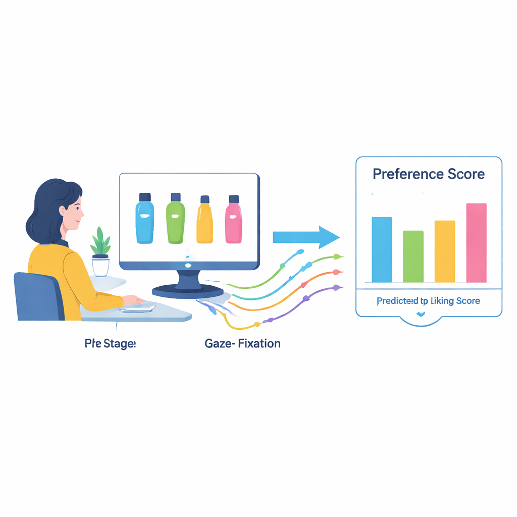
The researchers focused on a familiar product—shampoo—and recruited 30 university students to take part in lab experiments. Participants viewed carefully designed images of shampoo bottles on a screen while an eye-tracking device recorded exactly where and for how long they looked. At the same time, volunteers rated how much they liked each design on a simple five-point scale from “strongly dislike” to “strongly like.” This synchronized setup created a rich data set that connected people’s real-time visual behavior with their stated preferences, allowing the team to look beyond what people say and into how they actually look.
What Makes a Bottle Visually Appealing
To tease apart which design features matter most, the team systematically varied five basic elements: color saturation, brightness, hue (cool versus warm tones), the balance between images and text, and the overall shape of the bottle. All samples were stripped of brand logos to avoid bias. Across many comparisons, the same pattern kept emerging. Under the conditions tested, people tended to favor bottles with medium-high color saturation and brightness—colors that were vivid but not harsh—cool tones such as blues and blue-greens, a modest amount of imagery rather than text-only labels, and bodies that were rounded but not excessively bulbous or sharply angular. These preferences showed up both in the ratings and in the way people’s eyes lingered on certain designs.
From Eye Movements to a Prediction Formula
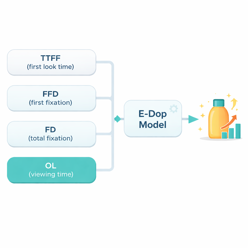
Looking is not random: where the eye goes reflects what the brain is processing. The study used several standard eye-tracking measures, including how long it took for someone to first look at a design (Time to First Fixation), how long that first look lasted (First Fixation Duration), the total time spent fixating on it, and the overall viewing time within the area of interest. The researchers combined four of these measures into a mathematical model they call the Eye-tracking Degree of Preference, or E-Dop. In essence, shorter times to first look and longer, deeper viewing were associated with higher liking scores. A multiple linear regression analysis showed that, for this group, the E-Dop formula could explain more than 70 percent of the variation in subjective preference scores, a strong result for human behavior research.
Testing the Model on New Viewers
To check that the E-Dop model was not just fitting noise, the team used a rigorous validation strategy called Leave-One-Subject-Out Cross-Validation. They repeatedly rebuilt the model while leaving out one participant at a time, then asked it to predict that person’s preferences from their eye movements alone. Across all 30 participants, the predicted scores closely matched the actual ratings, with a high correlation and small average error. This suggests that within this relatively homogeneous group—Chinese university students shopping for shampoo—the relationship between eye behavior and packaging preference is stable enough to be useful for forecasting how similar consumers will react to new designs.
What This Means for Everyday Products
For non-specialists, the takeaway is straightforward: our first glance at a package, and how our eyes roam over it in the following seconds, contain measurable clues about whether we will like it. This study shows that by watching the eyes, designers can move beyond guesswork and focus groups to a more objective, data-driven way of refining everyday product packaging. While the model was tested only in a lab and on a narrow slice of consumers, it offers an early blueprint for tools that could help companies quickly screen design options, tuning color, shape, and layout to better match what people are naturally drawn to—before the bottles ever reach the shelf.
Citation: Xiao, Y., Fang, J., Zhang, H. et al. Construction and analysis of a packaging design preference model using eye-tracking degree of preference. Sci Rep 16, 6080 (2026). https://doi.org/10.1038/s41598-026-36905-4
Keywords: packaging design, eye tracking, consumer preference, visual attention, emotional design