Clear Sky Science · en
Research on aging-friendly design risk assessment model based on non-parametric estimation
Why safer interfaces for older adults matter
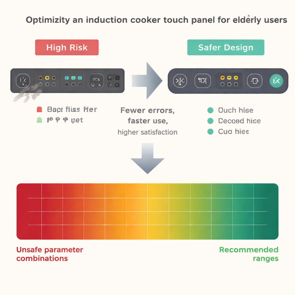
As more everyday products—from stoves to ticket machines—rely on glass touch panels and digital menus, many older adults are left struggling with tiny buttons, crowded layouts, and slow or confusing feedback. These small design choices can turn a simple task like turning on an induction cooker into a source of stress, mistakes, and even safety hazards. This study asks a practical question: how can we set clear, evidence-based rules for button size, spacing, text, and response speed so that older people can use smart devices both safely and comfortably?
Hidden risks in everyday button presses
Traditional “aging-friendly” guidelines often come from expert opinion or averages—what seems to work for a typical user in a lab. But older adults do not behave like averages. Their interaction with touch screens can swing from smooth to error-prone within seconds, especially when vision, motor control, or attention fluctuate. The authors point out three blind spots in current practice: reliance on expert judgment instead of real usage data, focus on simple averages that miss brief bursts of trouble, and neglect of rare but severe errors in the “long tail,” such as repeated wrong touches or long hesitations at critical steps. In short, today’s rules may describe what usually happens, but they do not guarantee safety when things go wrong.
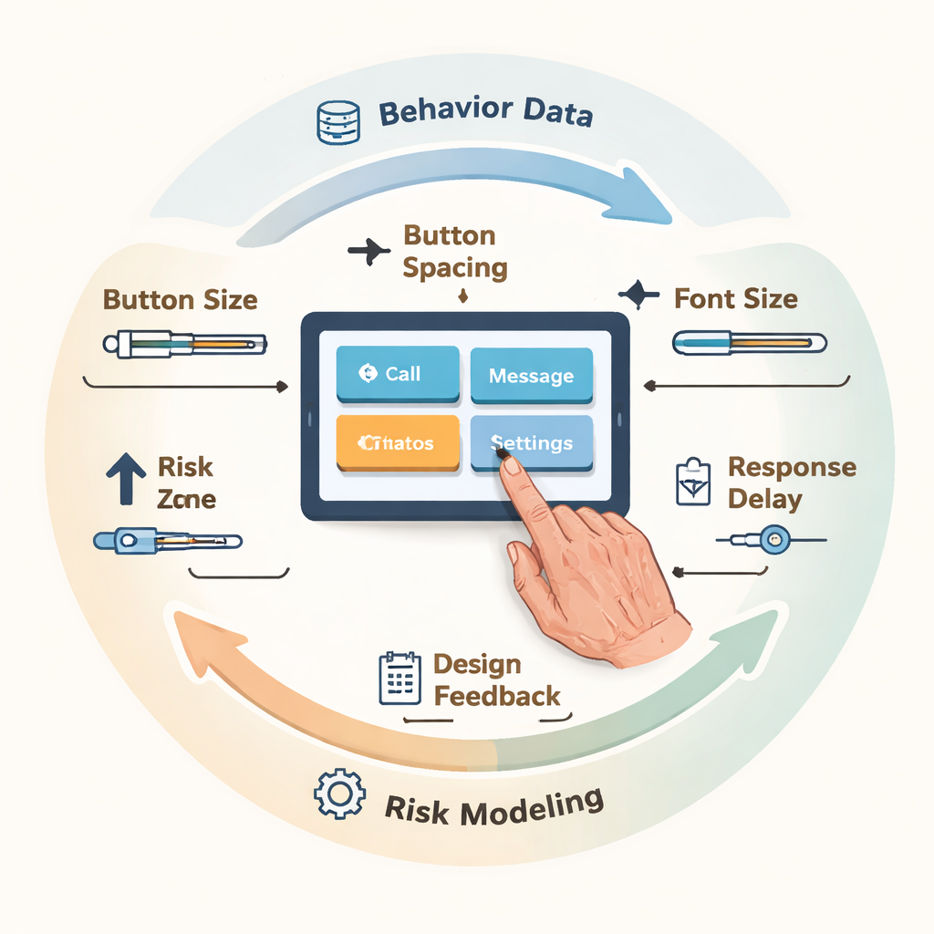
Turning real behavior into a risk map
To tackle this, the researchers built a risk assessment model that treats interface design more like financial risk management than simple usability testing. They invited 20 adults aged 60 to 75 to use a smart induction cooker’s touch panel under many combinations of button width, spacing, font size, and response delay. While participants carried out five common cooking tasks—powering on, setting heat, adjusting time, confirming, and stopping—the system logged every touch, error, repeat click, and second spent, and also recorded finger pressure signals and subjective ratings of ease and comfort. These raw signals were then combined into a single “risk score” that could be analyzed statistically.
Seeing both patterns and extremes
With this data in hand, the team applied a set of tools designed to uncover subtle and rare problems. First, they used a flexible “shape-fitting” technique to chart the full probability curve of touch error rates instead of relying on a simple mean. This revealed strong right-skewed, long-tail patterns when buttons were narrow (12 mm) and text was small (10 pt): some older users had error rates above 50%, far worse than the average would suggest. Second, they used wavelet analysis—a way of breaking signals into slow and fast components—to separate quick slip-ups from gradual build-ups of hesitation. Under slow system responses and cramped layouts, the pressure and timing signals showed frequent high-frequency spikes and rising low-frequency trends, indicating repeated corrections and growing uncertainty over the course of a task.
Drawing a safety line for design choices
Borrowing from finance, the study then used a measure called Value-at-Risk to define a “prudent boundary” for design: at a high confidence level (95%), how bad can the touch error rate get in the worst typical cases? If this risk exceeded a 30% error threshold, the design was deemed unsafe for vulnerable users. Through large-scale computer simulations across many parameter combinations, the model searched for settings that not only kept average risk low but also kept the worst cases under control. The resulting “safe and usable zone” pointed to a sweet spot: button widths of at least 16 mm, spacing of at least 10 mm, font sizes of 14 pt or larger, and response delays no longer than about 400–500 milliseconds. In follow-up tests using a refined prototype, these settings cut error rates by about half, shortened task time, slashed unnecessary repeated taps, and raised satisfaction scores.
From rules of thumb to proof by numbers
For non-specialists, the core message is straightforward: when designing touch panels for older adults, “big enough, clear enough, and fast enough” is not just a matter of taste—it can be quantified and tested. By watching how real people actually behave over time, and by paying special attention to the rare but serious missteps, the authors show how to turn vague advice into concrete ranges for button size, spacing, text, and feedback speed. Their closed-loop method—collect behavior, model risk, set a prudent boundary, and feed the results back into design—offers a template for safer, more inclusive interfaces in kitchens, clinics, and public spaces alike.
Citation: Li, H., Mao, M. & Yin, YQ. Research on aging-friendly design risk assessment model based on non-parametric estimation. Sci Rep 16, 6205 (2026). https://doi.org/10.1038/s41598-026-35991-8
Keywords: aging-friendly interfaces, touchscreen design, elderly usability, interaction risk, induction cooker controls