Clear Sky Science · en
Effects of workspace wall colors on productivity and emotion via immersive VR and physiological data
Why the Color of Your Office Walls Matters
Many of us sense that certain rooms help us focus while others feel oddly draining, but we rarely blame the paint on the walls. This study asks a simple, practical question: can the color of a workspace—red, blue, green, or yellow—actually change how well people work and how they feel? Using immersive virtual reality and body‑sensor data, the researchers show that color schemes do more than decorate a room: they can subtly shift productivity and mood in ways that matter for everyday office life.
A Virtual Office Built for Careful Testing
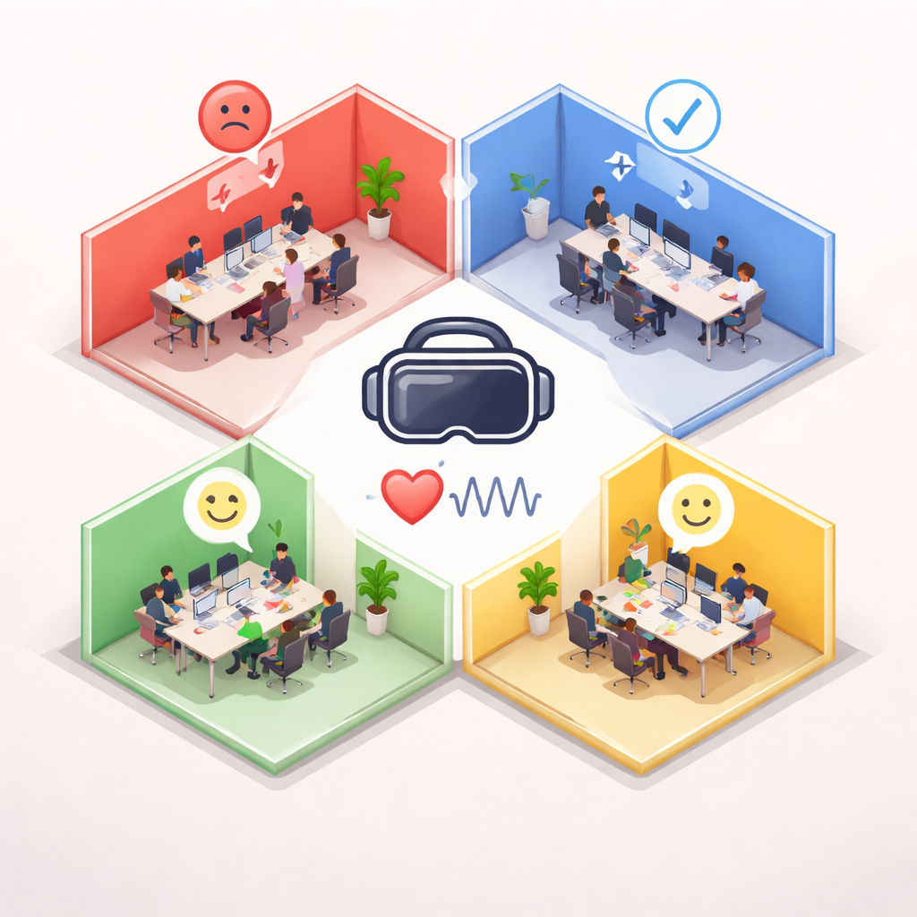
To untangle the effects of wall color from all the usual distractions in real offices, the team built a highly realistic virtual workplace. Participants wore a VR headset and found themselves seated at a desk in a modern open‑plan office, complete with digital coworkers and a computer screen. The only thing that changed from one session to the next was the colored wall banding around them: red, blue, green, or yellow, each combined with white so the spaces still felt like believable offices rather than cartoon boxes. Lighting, furniture, and viewing angle were held constant, and the virtual setup was carefully checked to feel immersive and comfortable, with most people reporting a strong sense of “being there” and little motion sickness.
Measuring Real Work, Not Just Impressions
Instead of asking people simply how they thought they would work in each room, the researchers gave them a concrete proofreading task. In every three‑minute session, participants read a short passage on the virtual monitor and tried to spot ten planted errors. Their productivity was defined by how efficiently they found mistakes, making it possible to compare performance across colors fairly. At the same time, the team tracked emotions in two ways. After each session, a short questionnaire captured positive feelings such as happiness, calmness, and excitement, and negative ones such as annoyance, anxiety, and sadness. Small sensors on the fingers and a wrist device recorded skin conductance and heart‑related signals, which are standard physiological indicators of stress and arousal.
Which Colors Help—and Which May Hinder—Productivity?
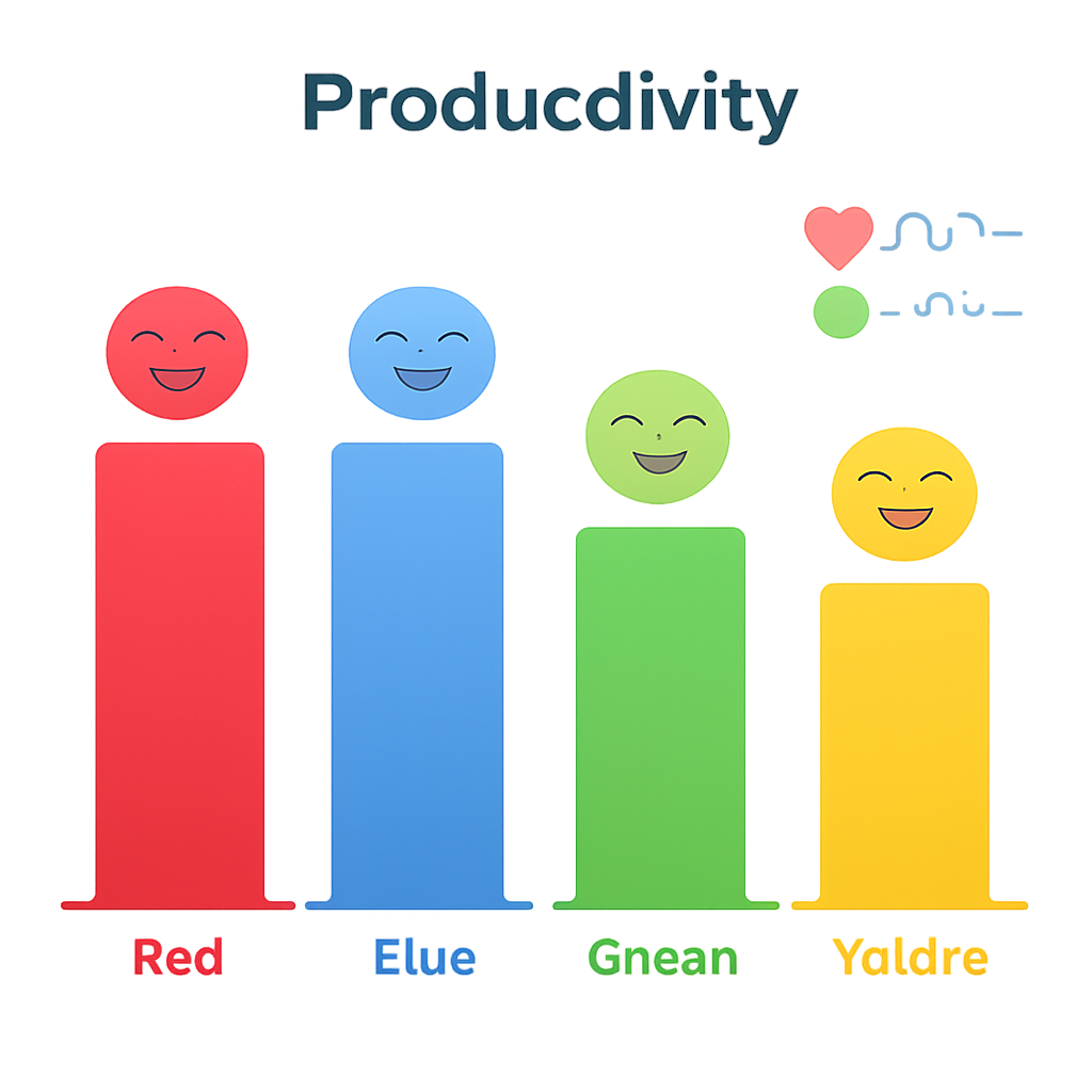
The clearest behavioral finding concerned productivity. When the virtual office was framed in green, participants were reliably less accurate in the proofreading task than when it was red, blue, or yellow. The differences were not huge, but they were strong enough to stand up to careful statistical checking. In other words, under the conditions of this experiment, green wall schemes were associated with somewhat poorer performance, whereas red, blue, and yellow schemes all supported higher levels of work accuracy. The researchers stress that this does not mean green is always a “bad” choice—real offices vary in many ways—but it does show that color is more than a matter of taste when it comes to focused cognitive work.
Colors Shape Feelings More Than Body Signals
The emotional picture was more nuanced. Yellow and blue workspaces tended to boost positive feelings: people reported feeling happier and calmer there than in red or green setups. Red, however, produced the highest negative feelings, especially annoyance and anxiety, even though it did not harm productivity relative to green. Surprisingly, the body‑sensor readings told a quieter story. Measures linked to sweat gland activity and heartbeat showed no meaningful differences between colors, suggesting that the emotional shifts were mostly psychological rather than large changes in underlying stress physiology—at least over the brief three‑minute exposure used here.
Balancing Comfort and Focus in Real Workplaces
For everyday readers, the take‑home message is that the walls around you can nudge both how you feel and how sharply you work. In this virtual office, green color schemes felt fine but coincided with slightly weaker performance, while blue and yellow made people feel better without a clear productivity boost, and red raised tension without obvious gains. The authors argue that real offices should treat wall color as a design tool, not an afterthought: choose palettes that support the kind of work being done and the emotional climate you want to foster. Because color and brightness are tightly intertwined, future studies will need to separate those factors more precisely. Still, this work offers concrete evidence that thoughtful use of color can be part of creating healthier, more effective workplaces.
Citation: Li, T., Zhang, Y., Pondo, JM. et al. Effects of workspace wall colors on productivity and emotion via immersive VR and physiological data. Sci Rep 16, 5502 (2026). https://doi.org/10.1038/s41598-026-35133-0
Keywords: office color, virtual reality workspace, productivity, emotional well-being, environmental psychology