Clear Sky Science · en
A study on design and multimodal evaluation of intuitive interfaces for complex information systems in manned/unmanned cooperation
Why smarter screens matter in high‑pressure missions
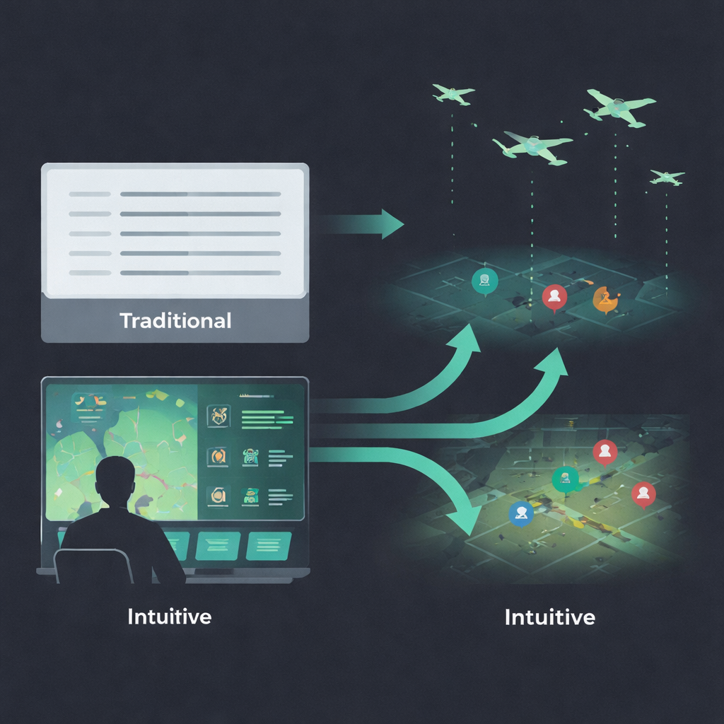
Modern military missions increasingly rely on teams of crewed aircraft working alongside swarms of drones. Commanders must sift through crowded radar screens and status panels in seconds, where confusion can mean missed threats or friendly‑fire mistakes. This study asks a simple question with big implications: if we redesign these complex screens to feel more “obvious” at a glance—using pictures, color, and motion instead of dense text—can people think faster, stay calmer, and still make the right call?
Turning gut feelings into screen design
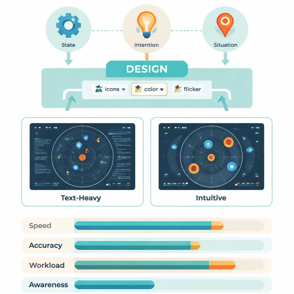
The researchers build on the idea of “intuitive interaction”: the way we automatically understand a red light as danger or a broken chain as a lost connection. Psychology and human‑factors research suggest that such built‑in patterns—bodily reflexes, everyday symbols, and familiar icons—can be harnessed so users do not have to consciously decode every bit of information. In this project, those ideas are applied to battle management screens that show three main kinds of information: what targets and weapons are present (state), what drones are about to do (intention), and how the overall fight is unfolding (situation). By mapping each of these to simple shapes, colors, and motion, the team aimed to create displays that “explain themselves” the instant they appear.
From expert sketches to working battle displays
Designing such an interface was not guesswork. The team first interviewed experienced operators and system designers, asking, for example, “What kind of symbol lets you recognize a jamming drone without thinking?” From these sessions they distilled keywords like eye, wave, chain, and zone, then turned them into rough icon sets. A second expert group then tested these prototypes while thinking aloud. Any symbol that was not understood correctly by everyone was revised until every element could be read instantly. The final interface used aircraft silhouettes instead of text labels, brightness to show threat level, flickering highlights to mark where a drone would move next, crosshairs or wavy lines to signal attacks or jamming, and small local markers under each target to show whether it had entered a critical range.
Putting intuitive screens to the test
To see whether these ideas worked in practice, 30 trained Air Force personnel sat at a simulated command console and ran through mock battlefield tasks. Sometimes they used a traditional text‑heavy display; other times they used the new intuitive version, with layout and color carefully matched so that only the way information was coded differed. As they searched for specific drones, missiles, threat levels, link failures, or targets in range, the system recorded how fast and how accurately they responded, where their eyes moved, and how their brains reacted using EEG signals linked to mental workload. Afterward, participants rated how demanding the tasks felt on the well‑known NASA‑TLX workload scale.
Faster eyes, lighter brains
The intuitive screens consistently helped under low and moderate information load. Operators answered faster—often hundreds of milliseconds quicker per query—and needed fewer eye fixations and jumps to find the right item. Dynamic cues like gentle flicker were especially effective for highlighting a drone’s future position, while widely understood symbols (such as aiming reticles for attack) beat more cryptic professional codes when describing upcoming actions. Brainwave measures told the same story: a key signal called P300, which grows with effort and delay in processing, was smaller and occurred earlier with intuitive displays, showing that the brain was working more efficiently. For dense, high‑load tasks the advantage shrank, suggesting that no interface can fully cancel out extreme complexity.
What this means for people in the loop
In a follow‑up test on an optimized version of the intuitive interface, a new group of operators showed better situational awareness, higher effectiveness, and lower reported mental strain across the board compared with the traditional layout. Put simply, by turning numbers and jargon into clear pictures, color codes, and motion that align with everyday experience, the system let people spot threats and opportunities more quickly and with less mental fatigue. While the work was done in a lab with a narrow user group, it offers a concrete recipe for designing future control rooms—military or civilian—where human operators must keep pace with intelligent machines without being overwhelmed.
Citation: Qu, J., Chen, S., Dang, S. et al. A study on design and multimodal evaluation of intuitive interfaces for complex information systems in manned/unmanned cooperation. Sci Rep 16, 4746 (2026). https://doi.org/10.1038/s41598-026-35017-3
Keywords: intuitive interfaces, human–machine teaming, situational awareness, eye tracking and EEG, manned–unmanned cooperation