Clear Sky Science · en
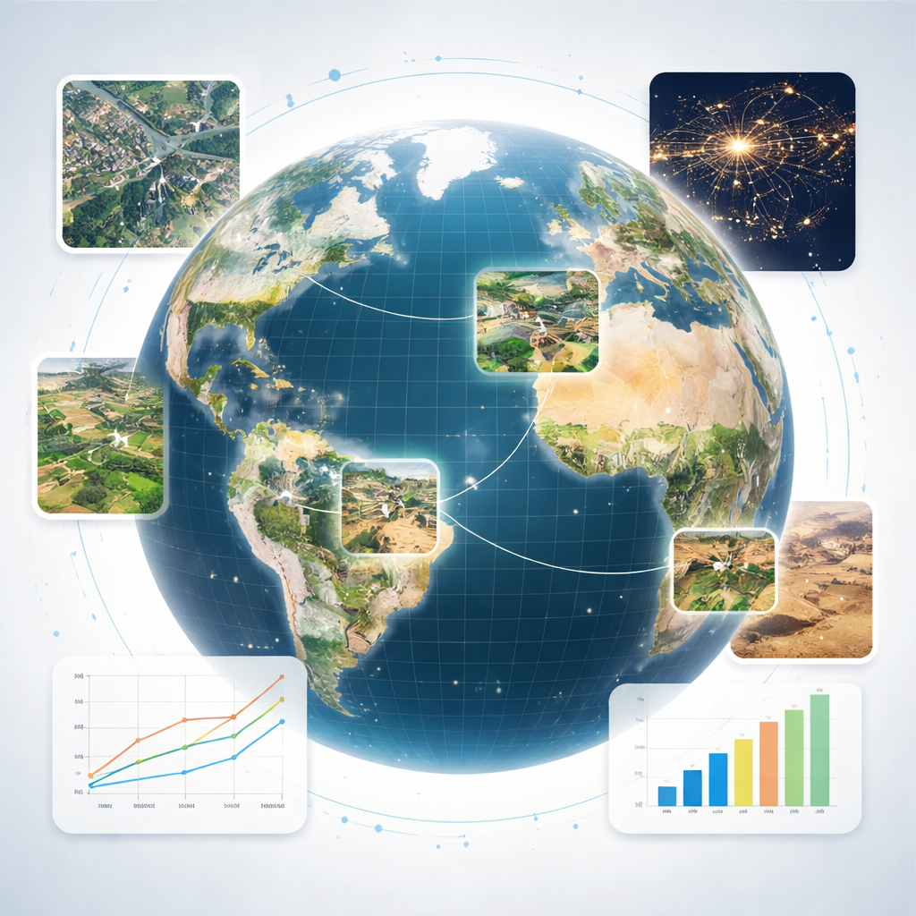
Global high-resolution estimates of the UN Human Development Index using satellite imagery and machine learning
Why mapping human progress more precisely matters
The Human Development Index (HDI) is one of the most widely cited yardsticks of global progress, combining health, education, and income into a single number for each country. Yet most decisions that shape people’s daily lives—where to build a clinic, how to target disaster aid, which towns need new schools—are made at much smaller scales than nations. This study shows how satellite imagery and modern machine learning can turn a coarse, country-level metric into a detailed global map of human development at the level of municipalities and 10-kilometer grid cells, revealing patterns that national averages hide.
From country averages to street-level insight
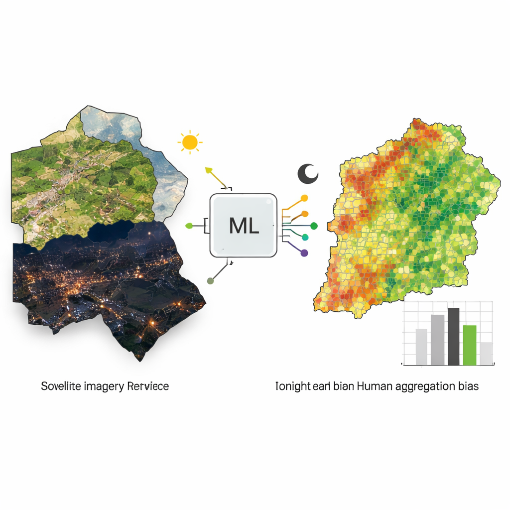
Until now, official HDI data have been published only for 191 countries, with a few research efforts pushing down to large provinces or states. That is far too coarse for many real-world uses, such as pinpointing the poorest neighborhoods within a region or comparing nearby towns that share a provincial government but have very different opportunities. Collecting HDI-style information locally via household surveys is slow and expensive, which is why many policymakers fall back on easier-to-measure indicators like income alone. The authors tackle this gap by using freely available satellite images of Earth’s surface—both daytime pictures of buildings, roads, and farmland and nighttime images of electric light—to infer local patterns of human development worldwide.
Teaching algorithms to read landscapes
Instead of trying to guess HDI directly for each tiny square of land—which is impossible because no such fine-scale HDI measurements exist—the team developed a clever workaround. They first transformed high-resolution satellite photos into thousands of numerical “features” that summarize patterns of color and texture, such as how urbanized, agricultural, or forested an area looks, and how bright it appears at night. They then averaged these features up to match the shapes of provinces where subnational HDI estimates are available. A simple linear model learned how combinations of these features relate to provincial HDI. Because the features can also be averaged over any other shapes, the same relationship can then be applied to much smaller areas—municipalities and regular grid cells—without changing the underlying model.
Checking accuracy against real-world data
To test whether this downscaled HDI is trustworthy, the authors compared their satellite-based estimates with census-derived HDI for municipalities in Indonesia, Brazil, and Mexico—three countries where detailed data already exist. Depending on the country, their approach captured about one-fifth to more than half of the variation in HDI between municipalities within the same province. They ran additional tests using other development-related measures, such as an international wealth index and nighttime lights themselves, and showed that a model trained only on coarse provincial averages can still predict these variables at much finer scales with reasonable accuracy. This suggests the method is broadly reliable for translating higher-level statistics into local estimates.
What ultra-detailed maps reveal
Using this method, the researchers created global HDI maps for over 61,000 municipalities and more than 800,000 10-kilometer grid cells for the year 2019, and made them publicly available. These maps expose sharp differences within provinces that look uniform in official statistics: city centers with high HDI surrounded by poorer suburbs, pockets of development along major roads, and river valleys that fare better than nearby deserts or mountains. When the team compared provincial HDI rankings with their finer-grained estimates, they found that more than half of the world’s population had been placed in the wrong national HDI quintile because coarse averages smeared together better-off and worse-off communities. In some cases, people labeled among the least developed regions at the provincial level would actually fall into the top two quintiles when viewed at municipal or grid scale, and vice versa.
Implications for fairer and smarter policy
For a lay reader, the takeaway is that where you live within a country can matter as much as which country you live in. By revealing detailed patterns of human development, these satellite-based maps can help governments and aid organizations direct resources more precisely—supporting the specific towns and neighborhoods that need the most help, rather than entire large regions that mix rich and poor areas together. The authors caution that these estimates do not replace on-the-ground surveys and that performance has only been directly validated in a few countries. Still, in places where data are scarce, this approach can provide a powerful, low-cost complement, turning our growing view of Earth from space into a practical tool for advancing human well-being.
Citation: Sherman, L., Proctor, J., Druckenmiller, H. et al. Global high-resolution estimates of the UN Human Development Index using satellite imagery and machine learning. Nat Commun 17, 1315 (2026). https://doi.org/10.1038/s41467-026-68805-6
Keywords: human development index, satellite imagery, machine learning, poverty mapping, spatial inequality