Clear Sky Science · en
Uncovering historical ceramic color patterns via visual analytics for design and heritage
Why the Colors of Old Ceramics Still Matter
Walk into a museum of Chinese ceramics and you are immediately struck by color: misty celadons, crisp blue-and-white, and jewel-like enamels. These glazes are more than decoration—they encode stories about taste, technology, and trade across centuries. Yet until recently, scholars and designers have had to rely on words and intuition to describe them. This article presents a new, data-driven way to read those colors at scale, turning thousands of ceramic photographs into maps of historical color trends that can also inspire today’s product design.
Turning Museum Photos into Usable Color Data
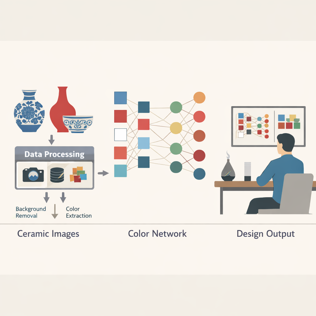
The researchers start with a practical problem: museums now hold huge digital image collections, but color research on ceramics is still mostly done by eye. To change that, they built an interactive Ceramic Color Design System using more than 1,400 images of Ming and Qing dynasty pieces from the National Palace Museum in Taipei—periods famed for their rich, technically advanced glazes. First, they carefully filtered the sample, removing objects with heavy damage, complex shapes, or large calligraphic inscriptions that would confuse color readings. For each remaining piece, they gathered structured information such as dynasty, reign, type of vessel (bottle, bowl, plate), and glaze classification, and stored it in a database to link images with historical context.
Boiling Thousands of Shades Down to a Palette
Every ceramic photo contains thousands of slightly different pixels, far too many for clear pattern-finding. The team therefore used modern computer-vision tools to clean and simplify the images. A deep-learning method automatically removed backgrounds so only the artifact itself remained. Then a clustering technique grouped similar pixel colors into a handful of dominant shades, like a digital artist summarizing the main impression of each piece. Very tiny color patches—such as stray marks or restoration traces—were filtered out so they would not skew the results. Finally, similar colors across the entire dataset were merged using a formula that approximates how the human eye judges color differences, ensuring that two visually indistinguishable blues from different photos would be treated as the same hue.
Building a Network Map of Historical Color Partners
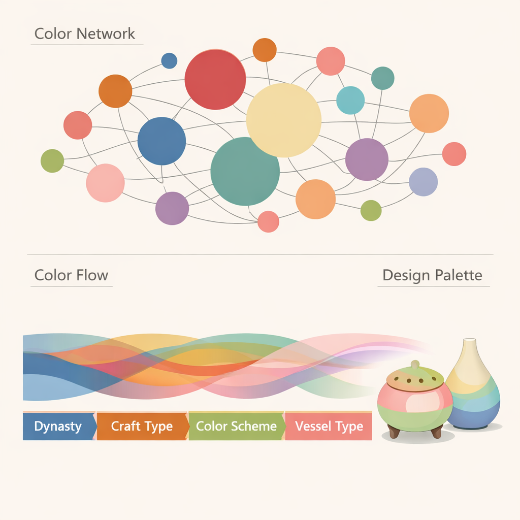
With clean palettes for each artifact, the authors treated color relationships like a social network. In their first “bipartite” network, one set of nodes stands for individual ceramic works and the other for key colors; links show which colors belong to which pieces. From this, they project a second network that only contains colors, connecting two hues when they appear together on the same object. Edge weights indicate how often colors co-occur, and centrality measures reveal which hues act as “base” tones that pair with many others, and which serve as distinctive highlights. Interactive views let users switch between these network types, zoom into a single piece, or pan out to see broad trends in hue, lightness, and variety across dynasties, glaze types, and vessel forms.
Following Color Through Time and Into New Designs
Beyond static networks, the system adds a flowing diagram that tracks how color preferences move through a chain of cultural categories—from dynasty to specific reign, to glaze type, to broad color scheme, to vessel shape. This makes patterns such as the enduring importance of blue-and-white, and the explosion of richer palettes like tea-powder and pastel glazes in the Qing, instantly visible. A color-search tool lets a designer start from one target hue, find its closest “family” of related shades, and see exactly which historical pieces use them. A separate color-space view reassures users that the merged colors still faithfully reflect the underlying data by plotting every tone back into a perceptual map tied to real artifacts.
From Imperial Enamelware to Modern Aroma Burners
To show how these analytics translate into actual products, the authors focus on Qing dynasty enamelled ceramics, known for their bright, intricate palettes. By filtering the data to this craft category and adjusting the color-merge settings, they gradually condense more than a thousand separate hues into just seven core colors. Network centrality analysis helps assign design roles: soft light greens, pinks, and blues become main body colors; vivid yellows and deep greens work as supporting tones; a reserved purple serves as an accent. Using this “genetic” palette, they design two series of ceramic aromatherapy pieces—one echoing traditional forms, the other embracing minimalist shapes—demonstrating how a historically grounded color system can flexibly support both classical and contemporary aesthetics.
What This Means for Heritage and Design
In essence, the article shows that the colors of old ceramics can be studied with the same quantitative rigor as any large dataset, without losing their cultural nuance. By converting photographs into structured networks of hues and pairing them with rich metadata, the system uncovers hidden “color communities” and long-term style shifts that would be hard to see by eye alone. Just as importantly, it gives designers a traceable bridge from museum objects to new products, allowing them to borrow historically authentic palettes rather than guessing. The authors argue that as datasets grow to include more periods and more detailed technical information, such tools could reshape how we preserve, understand, and creatively reuse the visual heritage encoded in ceramic color.
Citation: Wang, Y., Si, Z., Wang, W. et al. Uncovering historical ceramic color patterns via visual analytics for design and heritage. npj Herit. Sci. 14, 77 (2026). https://doi.org/10.1038/s40494-026-02314-z
Keywords: ceramic color, visual analytics, cultural heritage, color networks, design inspiration